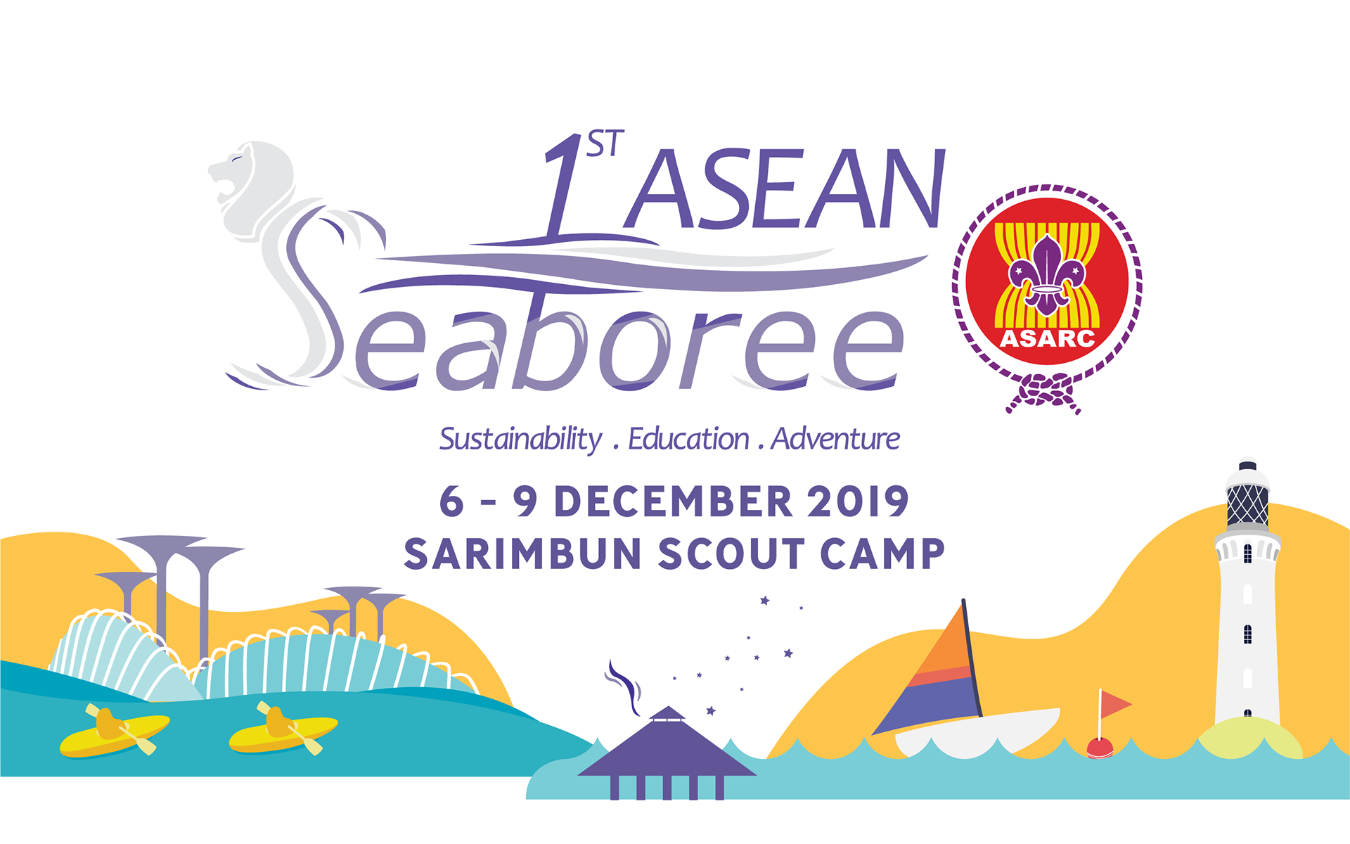
With less than three months before the event, I was tasked with developing a fresh visual direction that could bring greater energy and consistency to the Seaboree's communications.
While the original event logo was retained, I developed a supporting visual identity around it using vibrant colours, illustrations and graphic elements inspired by Sea Scouting and Singapore. The resulting system gave the event an energetic and optimistic character while remaining flexible enough to work across different applications.
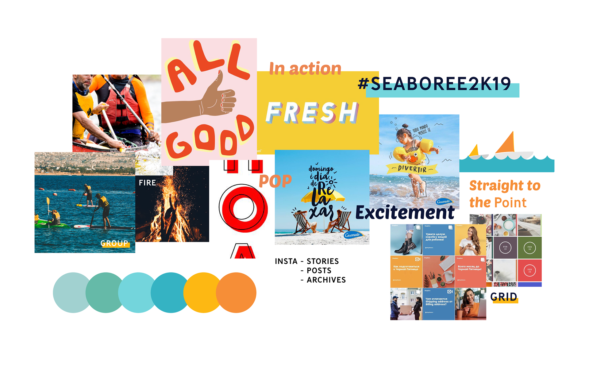
During the event, I also managed the Seaboree's Instagram presence, using a combination of photography, Instagram Stories and live content to translate the energy of the physical event into its digital communications.
Rather than treating social media separately, the same visual language and personality were carried through the online experience, allowing participants and followers to experience the event as it unfolded.
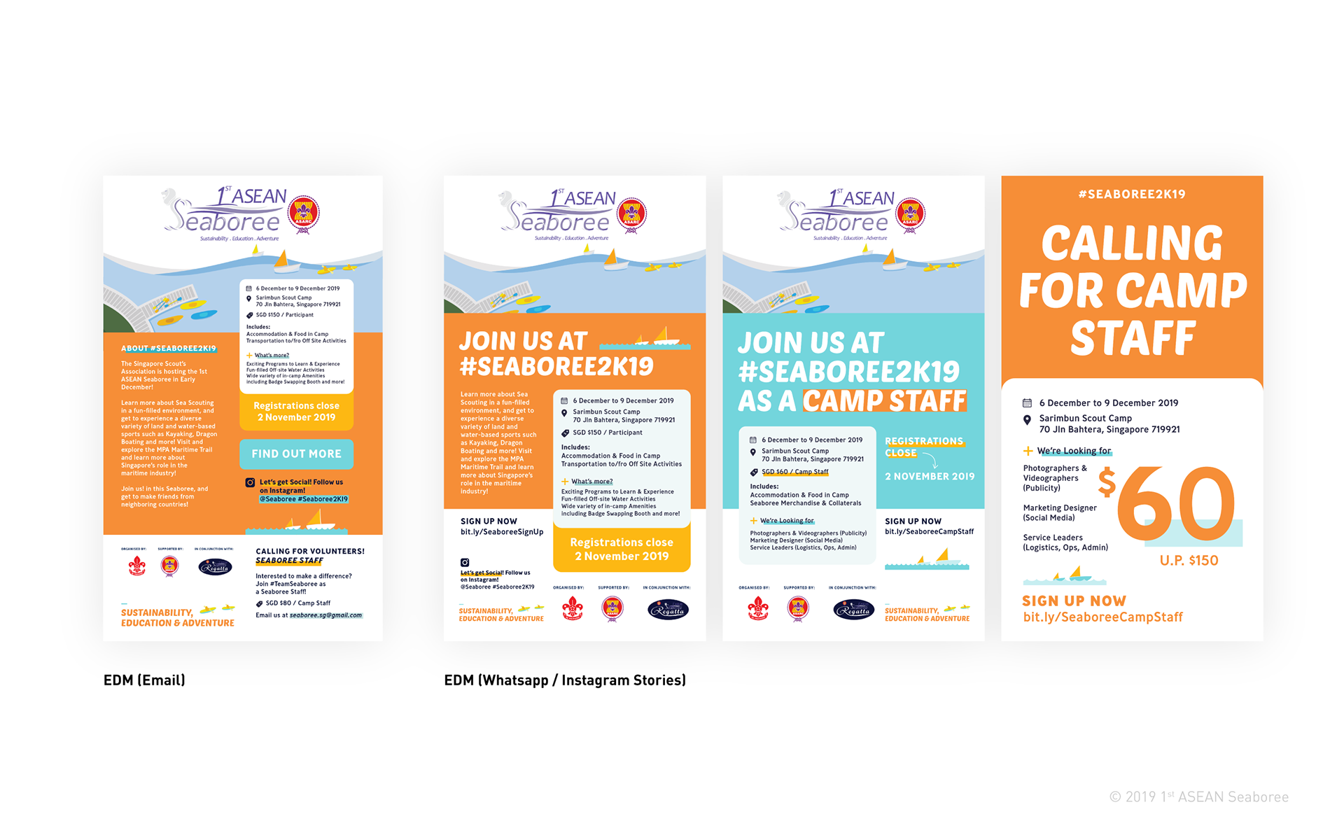
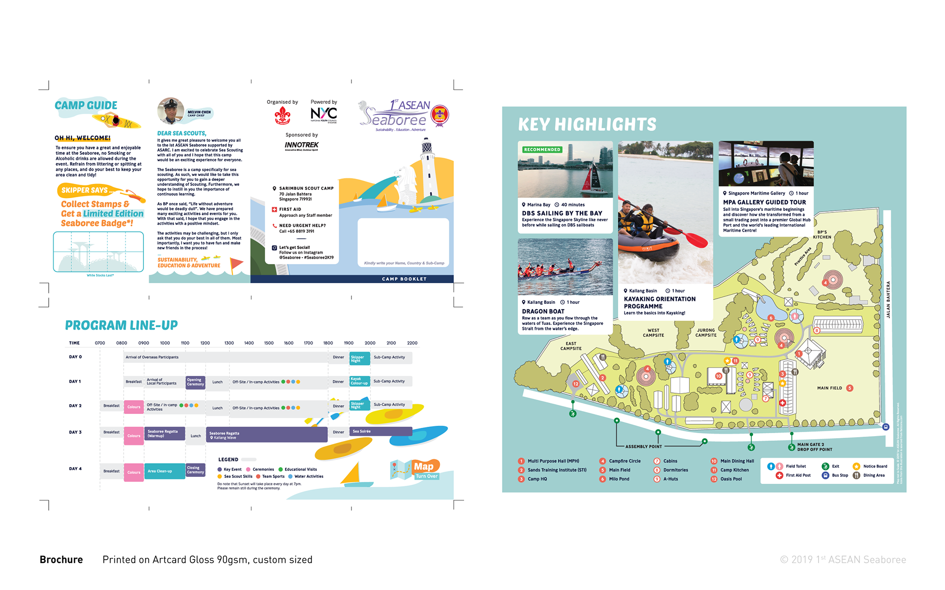
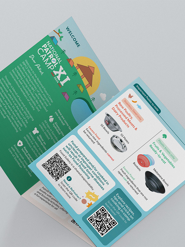
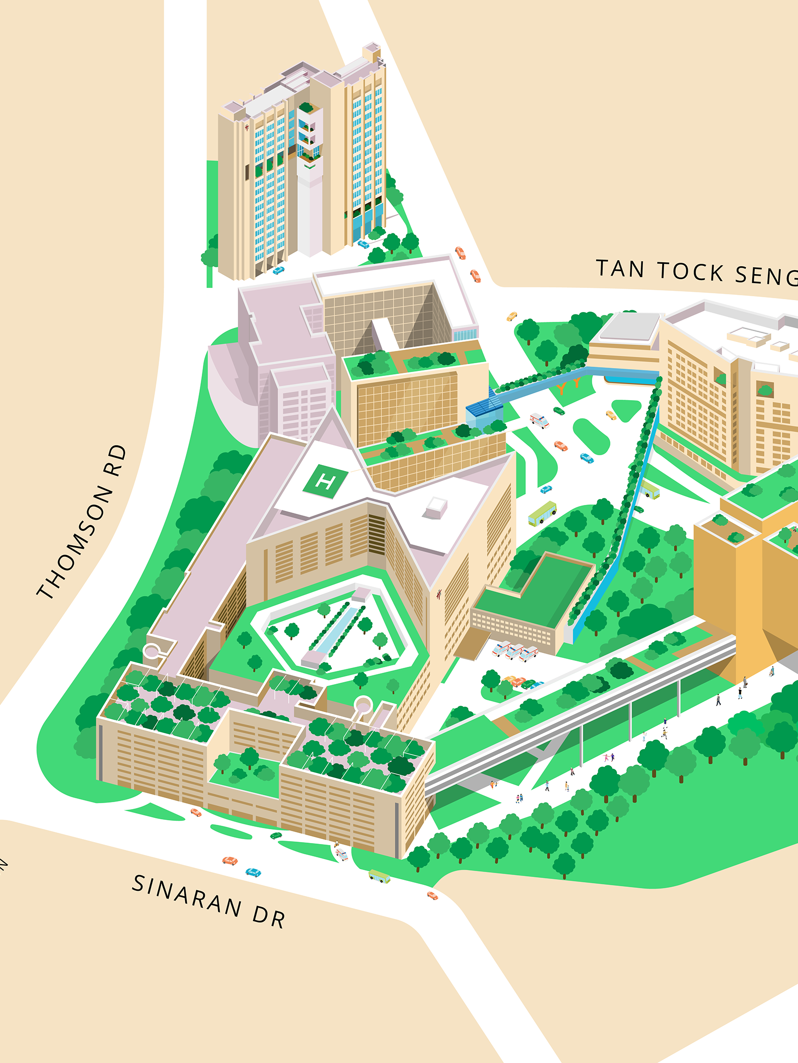
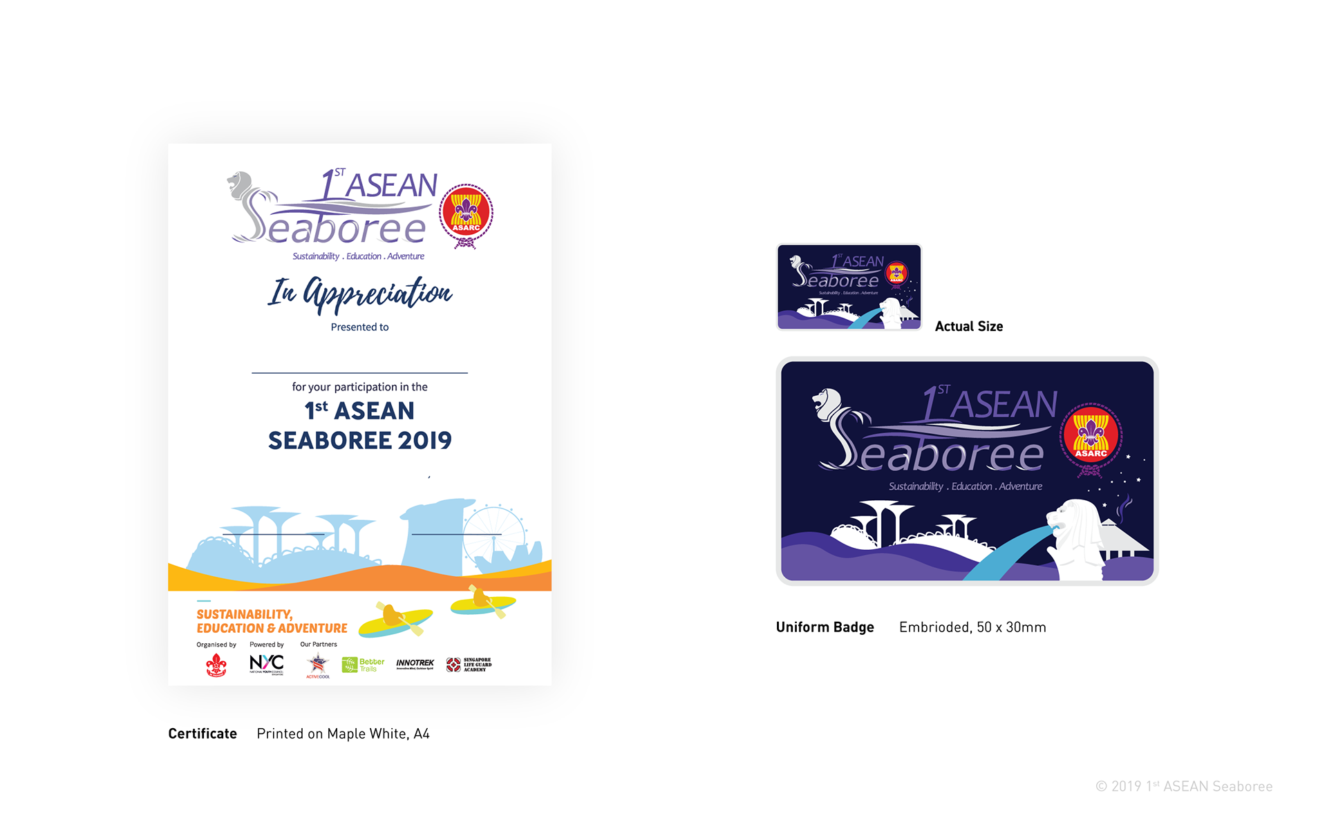
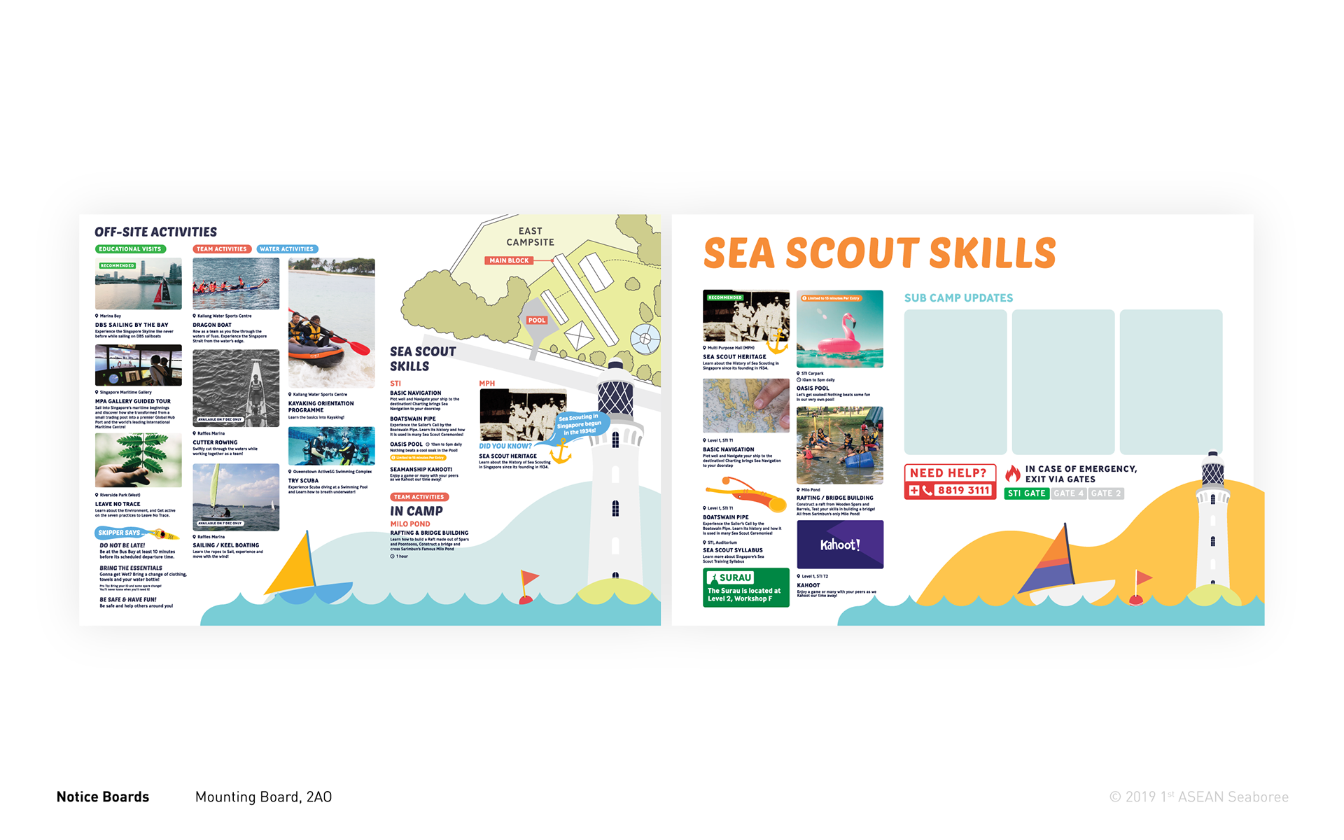
To help participants navigate the camp and stay informed about the programme, a range of supporting collaterals was developed. These included the printed programme, event brochure and in-camp map, alongside items such as appreciation certificates and embroidered badges.
Each collateral followed the same visual language established for the Seaboree, creating a consistent and recognisable experience across different touchpoints. Together, these applications helped extend the identity beyond the main event graphics and into the participants’ everyday camp experience.
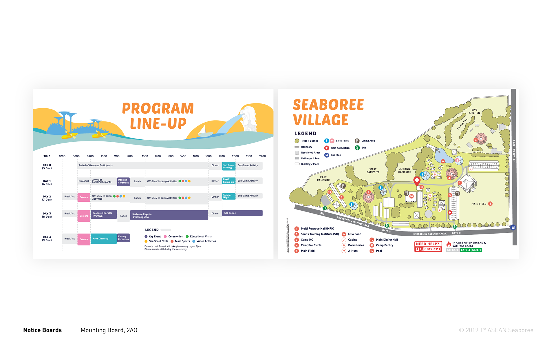
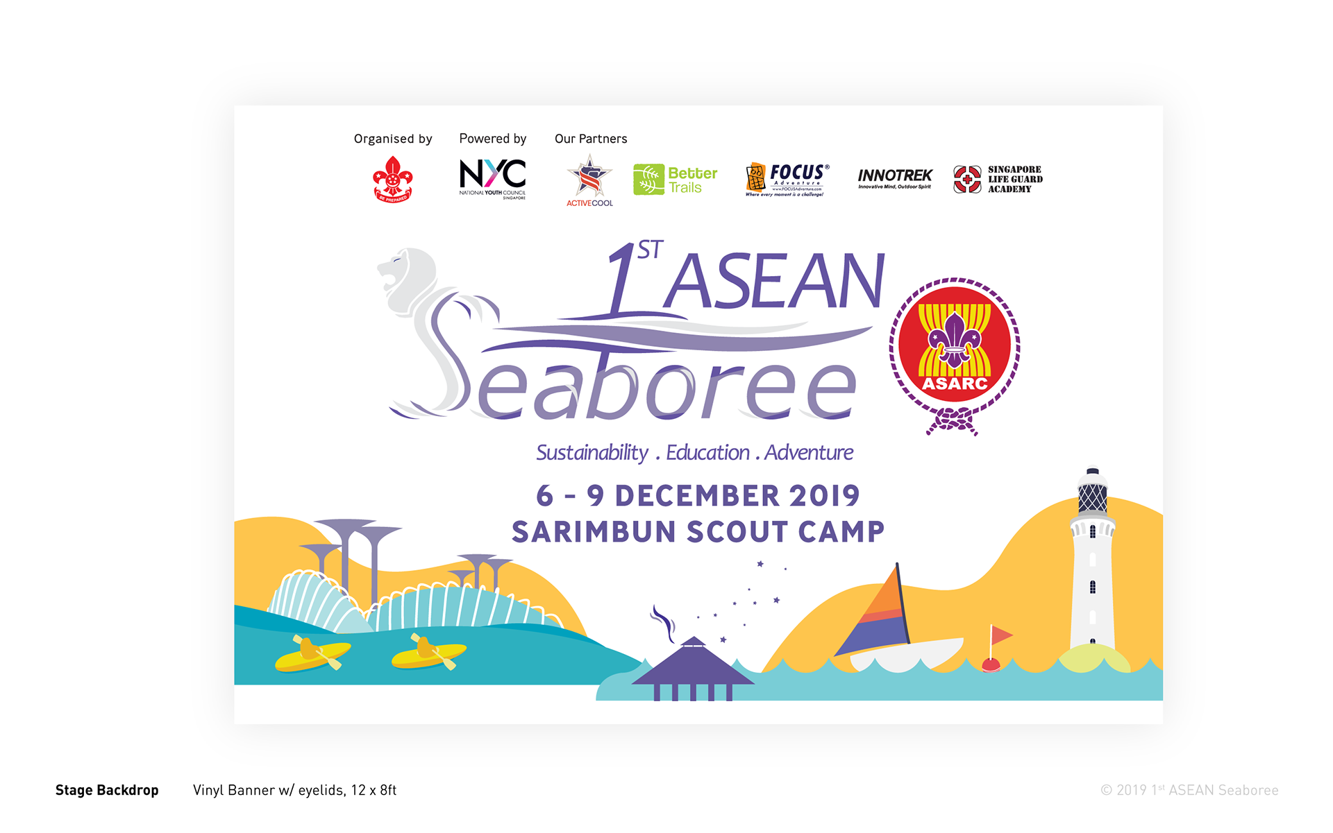
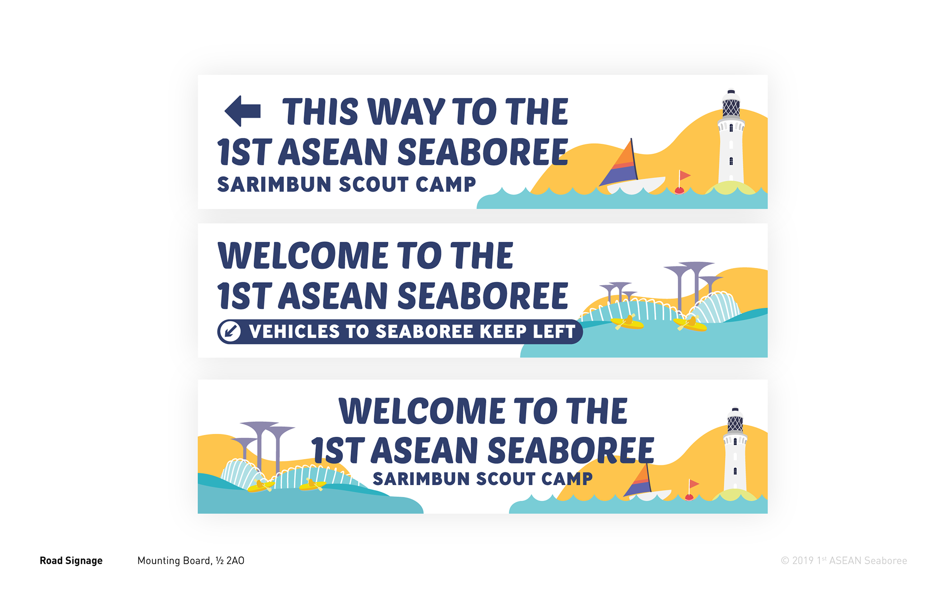
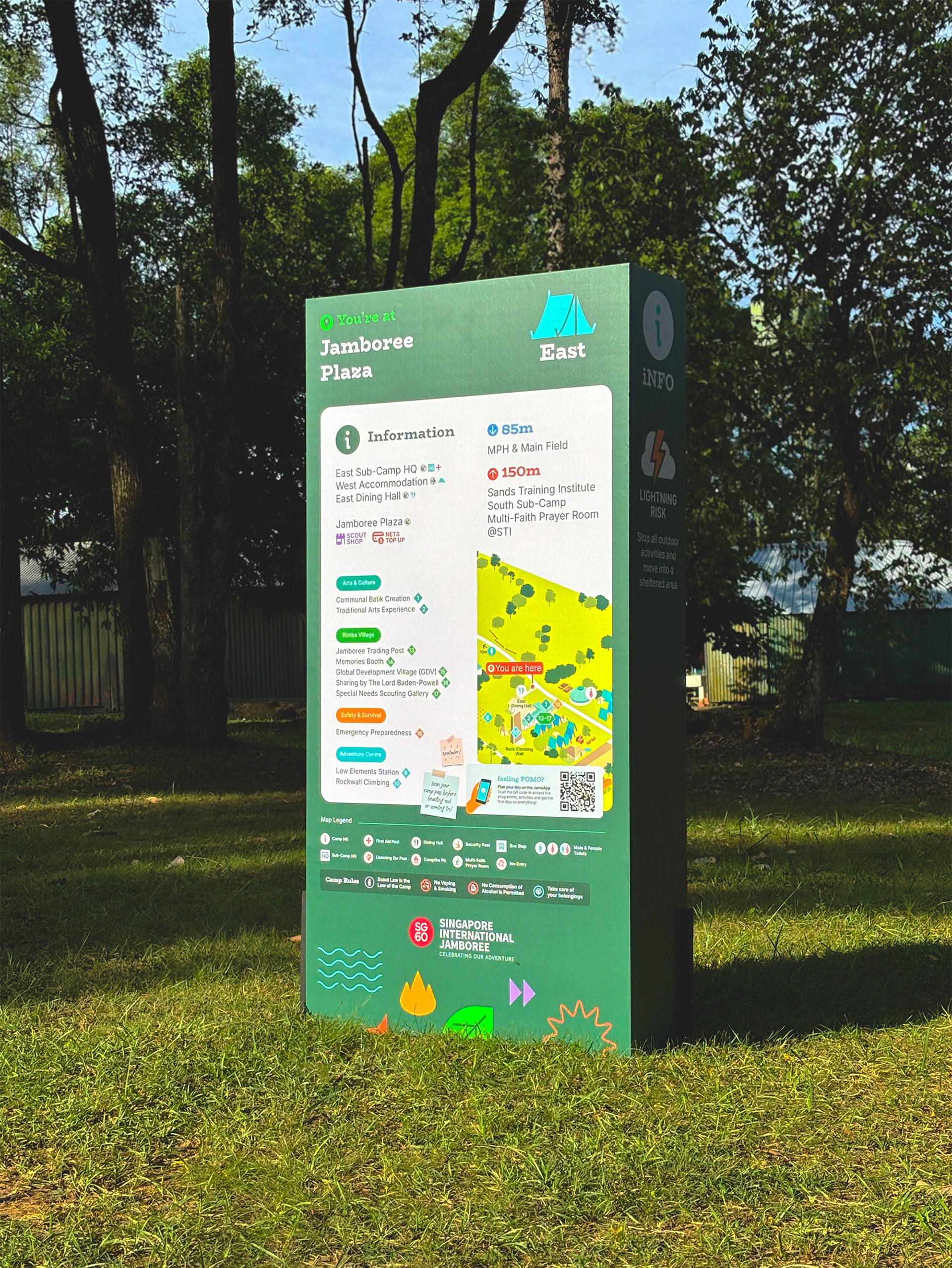
Wayfinding signs and labels were also developed to help participants navigate the camp independently and with minimal confusion. The approach was simple: provide the right information at the right place, so participants could find what they needed without having to constantly seek assistance.
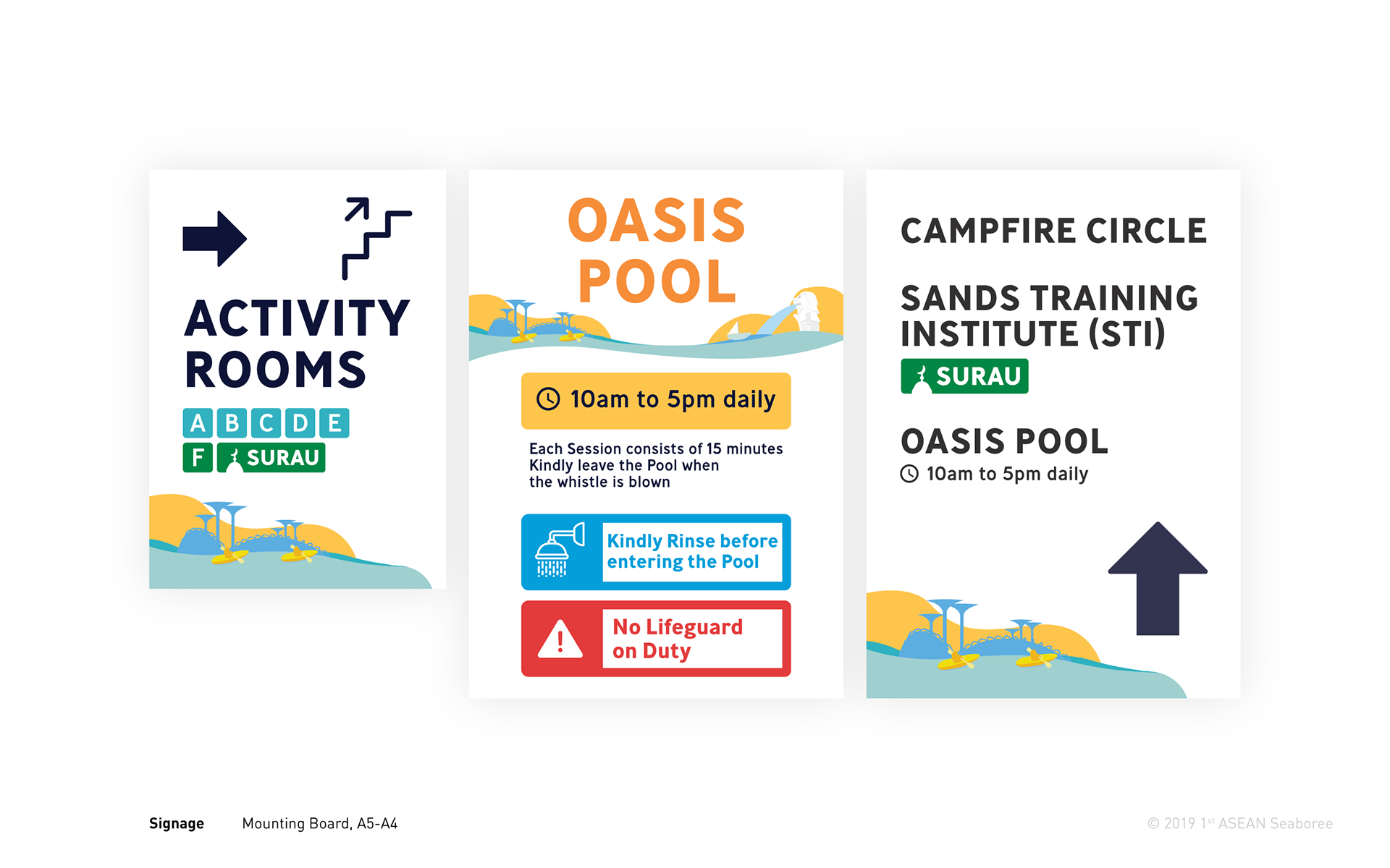
Designing these signs became an interesting exercise in information design and user experience. It challenged me to consider how people scan, interpret and act on information within a physical environment, and how visual communication could make those interactions clearer and more intuitive.
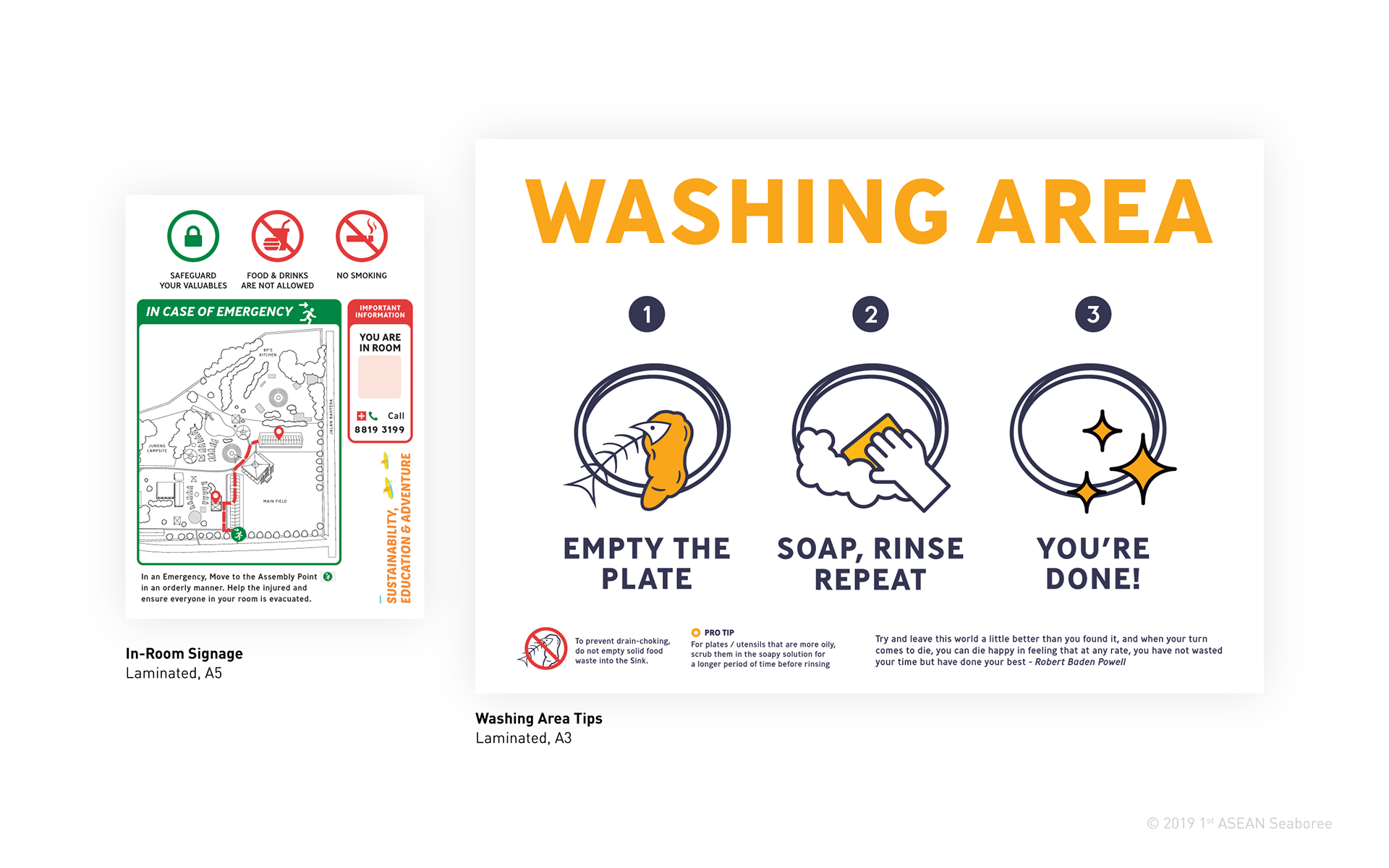
One small but meaningful outcome of the project is that the washing area signage remains in use at Sarimbun Scout Camp today, several years after the event — extending its purpose well beyond the Seaboree itself.
The 1st ASEAN Seaboree was particularly significant to me as the first large-scale event where I took the lead on design and art direction. Completed in 2019, the project was an early opportunity to think beyond individual deliverables and consider how a visual identity could function as a complete system — across print, environmental graphics, social media and the wider event experience.
At the same time, the project made me more conscious of the amount of material waste generated by temporary events, particularly from printed and environmental collaterals that may only be used for a few days.
This experience influenced how I approached subsequent projects, encouraging me to be more deliberate about what needed to be produced, how materials could be reduced or reused, and where digital alternatives could serve the same purpose. It became a small but important consideration in my design process — creating what is necessary while minimising what is left behind.