I was commissioned by Inspireo to create an interactive infographic introducing HealthCity Novena as Singapore’s leading integrated healthcare district to prospective audiences.
The experience was structured across four interconnected sections, taking users from a macro overview of the district down to individual landmarks and points of interest. Together, they create a visual narrative that progressively reveals the scale, connectivity and offerings of HealthCity Novena.
Designed primarily for the web, the infographic was envisioned as a scroll-driven interactive experience. As users move through the page, the map progressively unfolds, while interactive markers allow them to hover or select individual landmarks to discover additional information.
This approach transformed what could have been a conventional map into an exploratory experience, allowing users to understand both the district as a whole and the individual places within it.
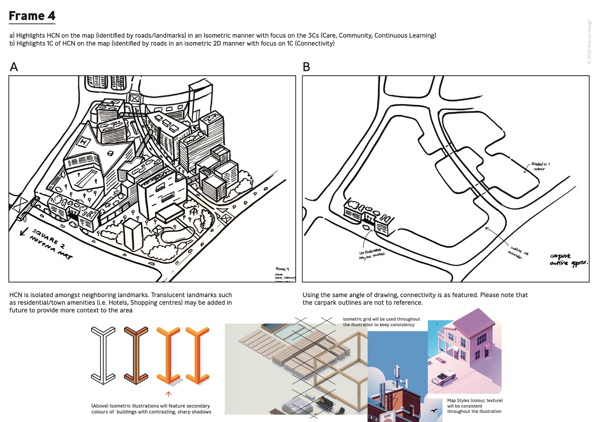
The creative direction was further deduced to create respective styles for the infographic. So as to ensure consistency in the way the brand is communicated, I opt to combine the use of colours from both the brand, and Map UI. More colours were also taken from the 3D rendering provided, giving the project an ample range of colours to utilise
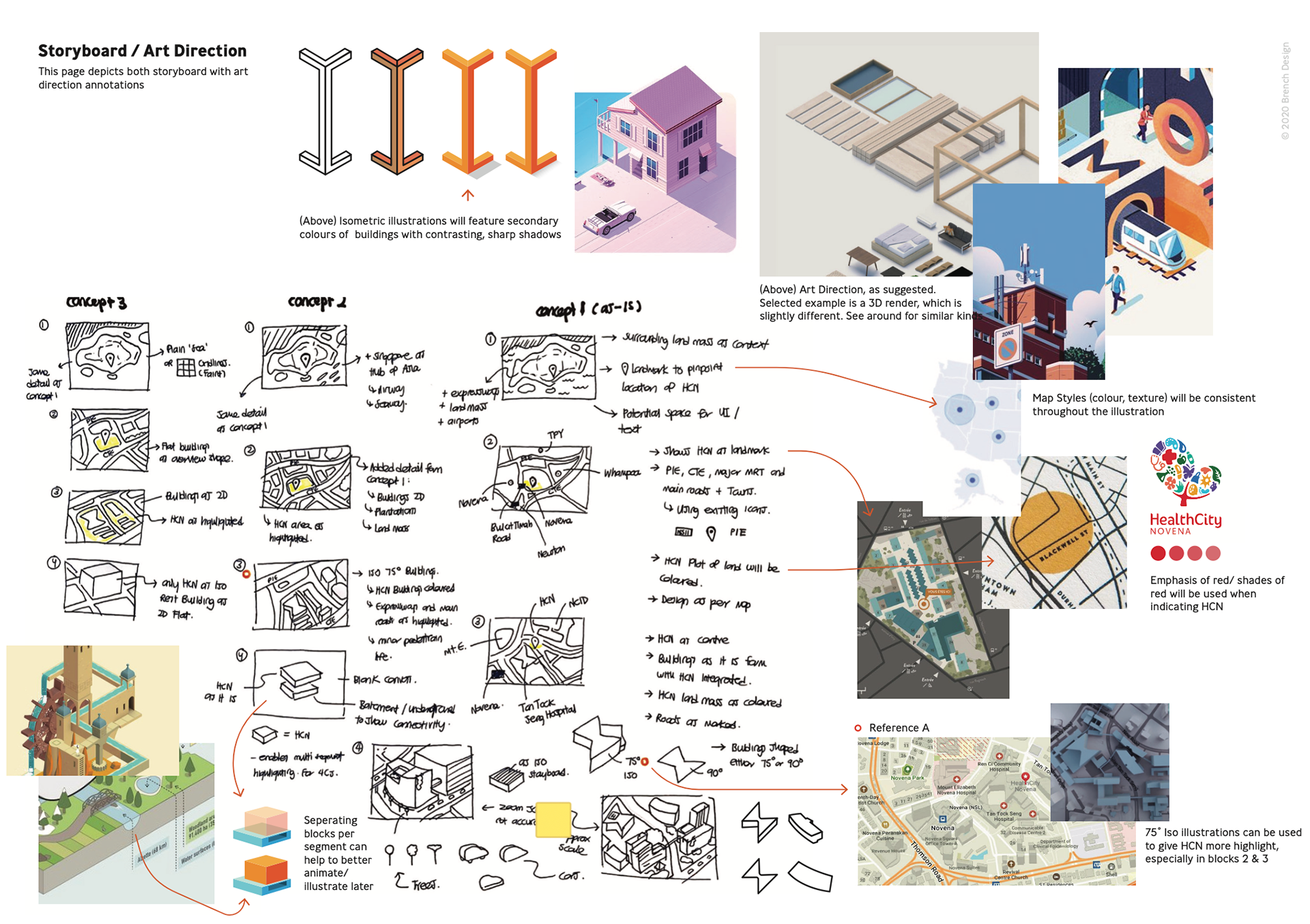
The project began with extensive visual research and reference gathering, exploring different approaches to information design, mapping, architecture and isometric illustration.
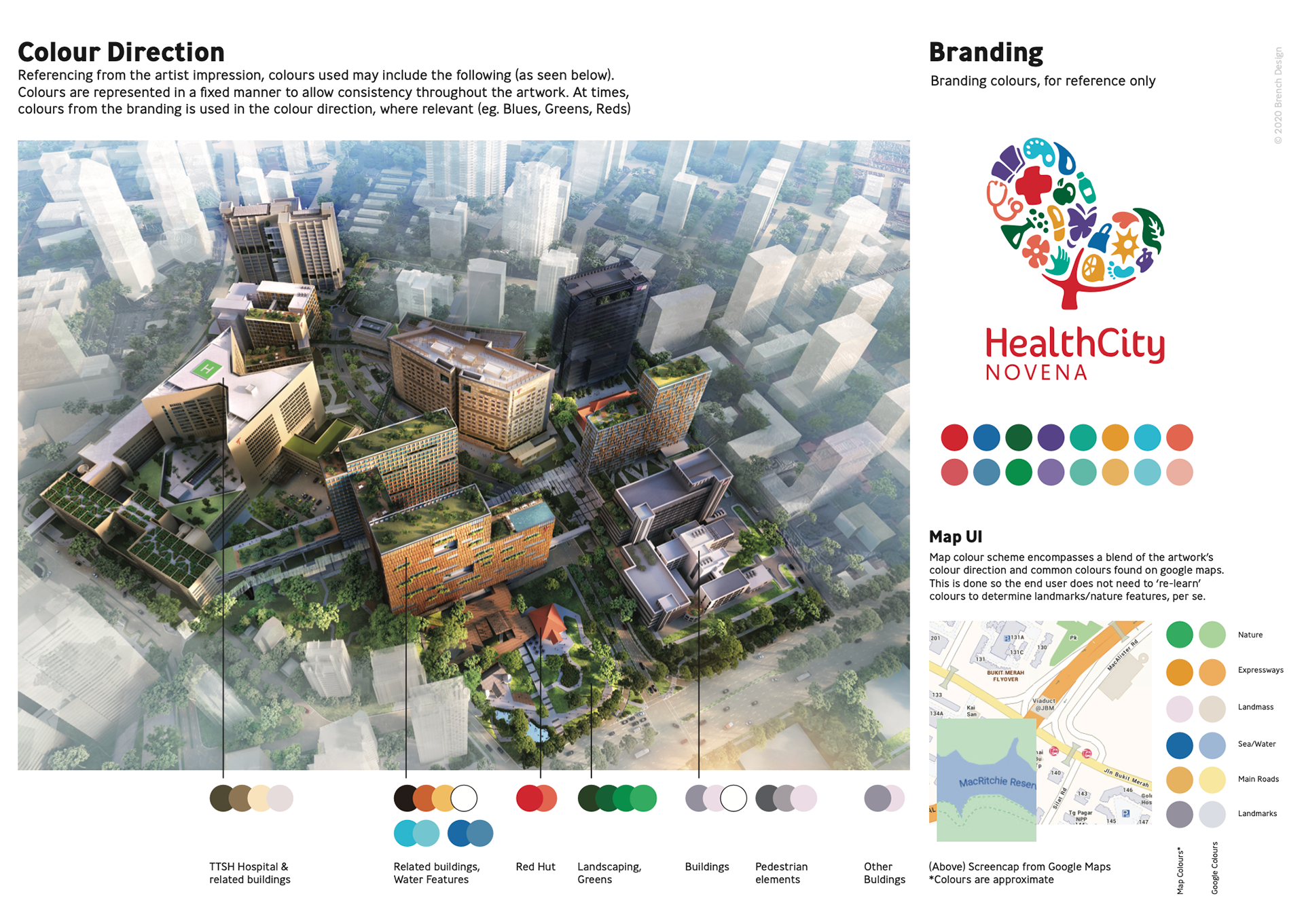
With the client requesting an isometric visual style, this became the foundation for the overall art direction. From there, I developed the storyboard, visual hierarchy, colour palette and illustration system, establishing a consistent framework for translating a complex physical environment into an accessible digital experience.
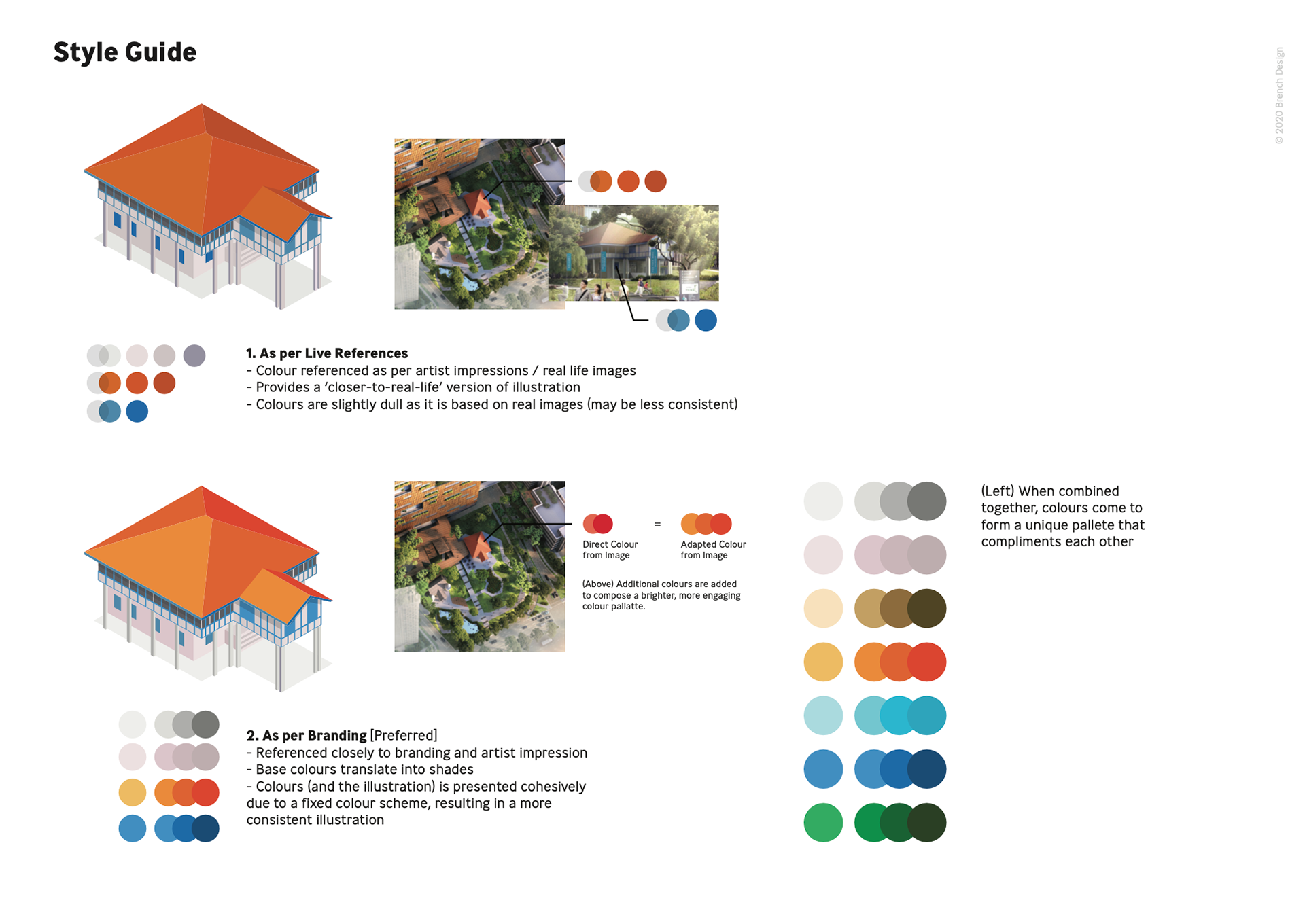
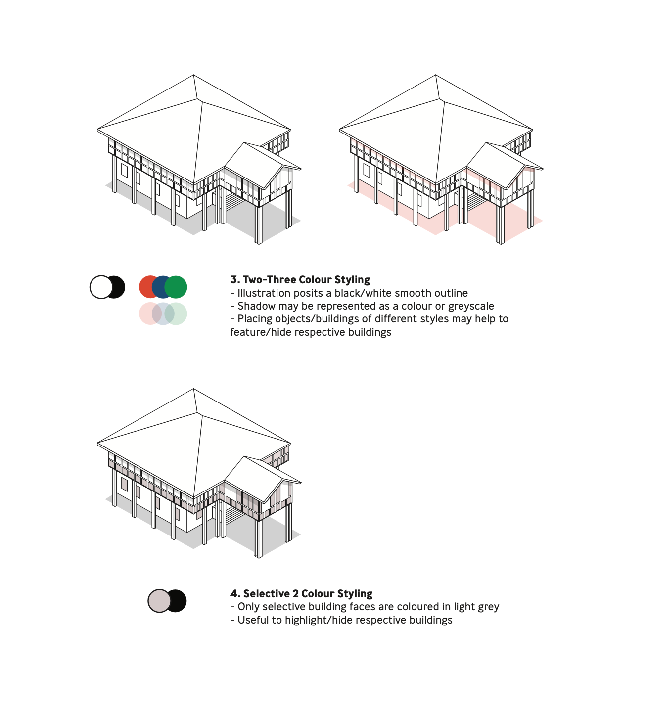
Isometric styles were also proposed, so that all possibilities can be considered before the design begins.
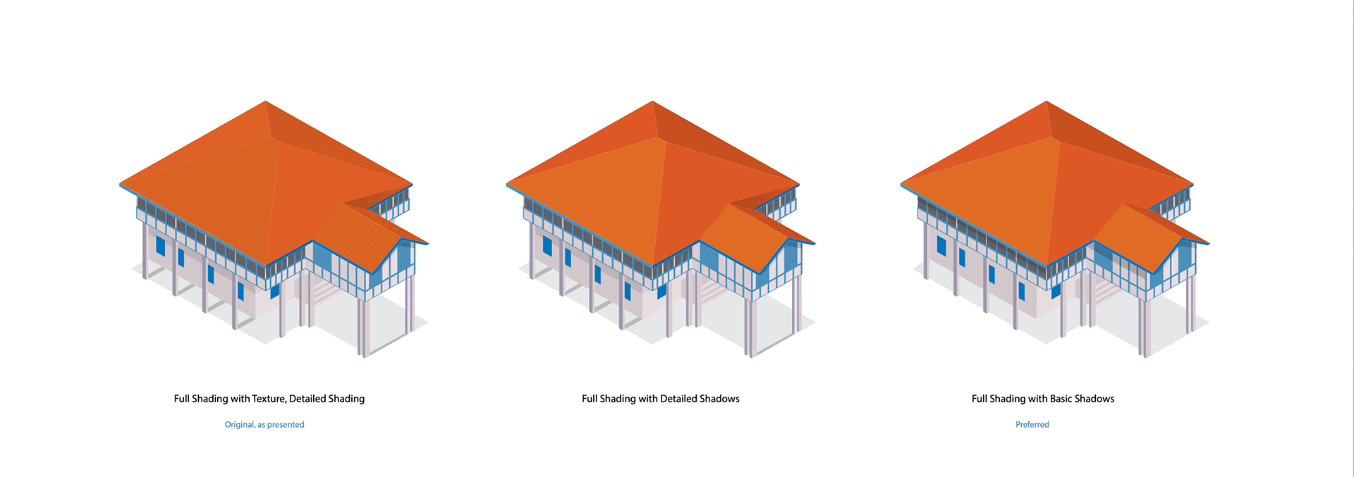
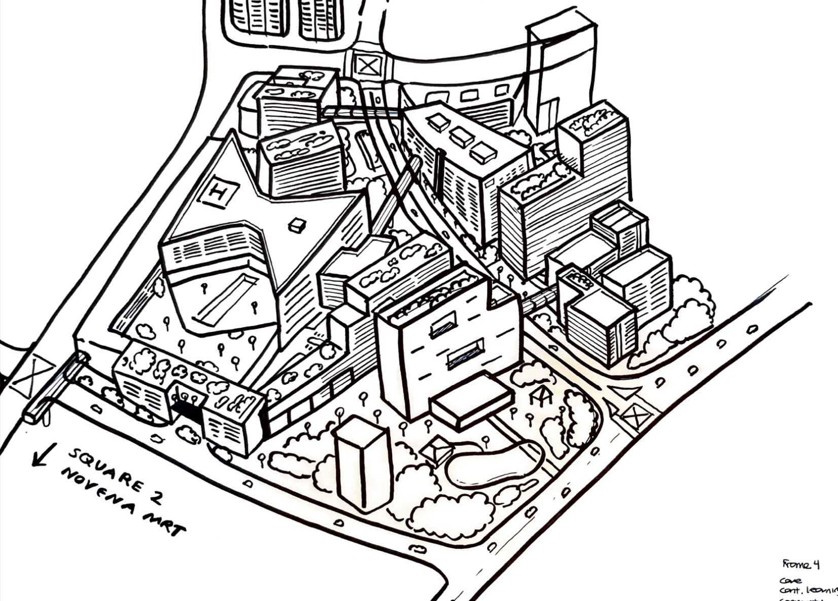
The illustration was developed in stages, with HealthCity Novena carefully reconstructed based on actual building drawings, site references and proportions.
A high level of detail was maintained throughout the process to ensure that the illustrated environment remained visually consistent with the real architecture. This helped minimise discrepancies between the final artwork and the physical buildings, while preserving a cohesive isometric style across the entire map.
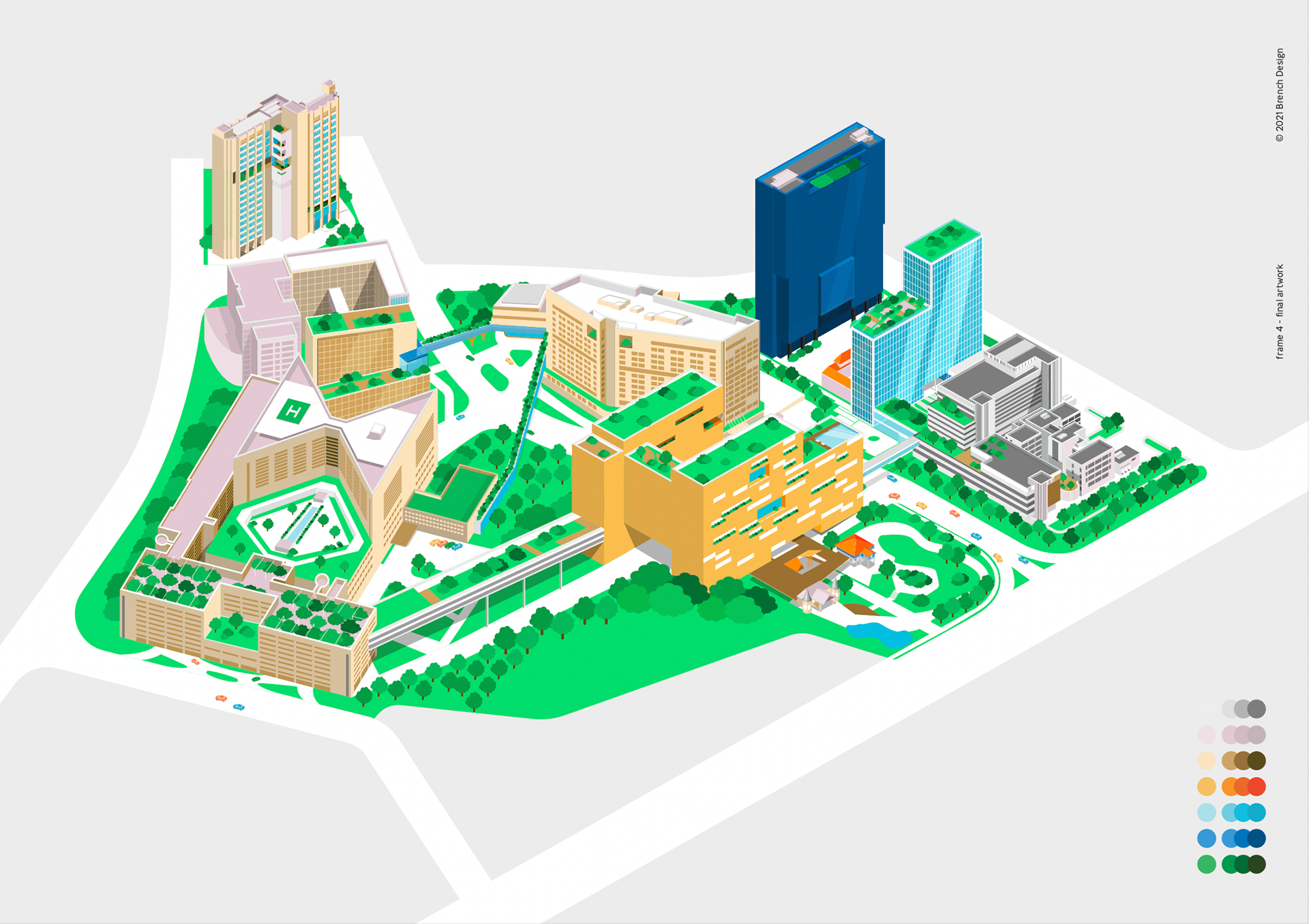
1st Draft of Key Visual
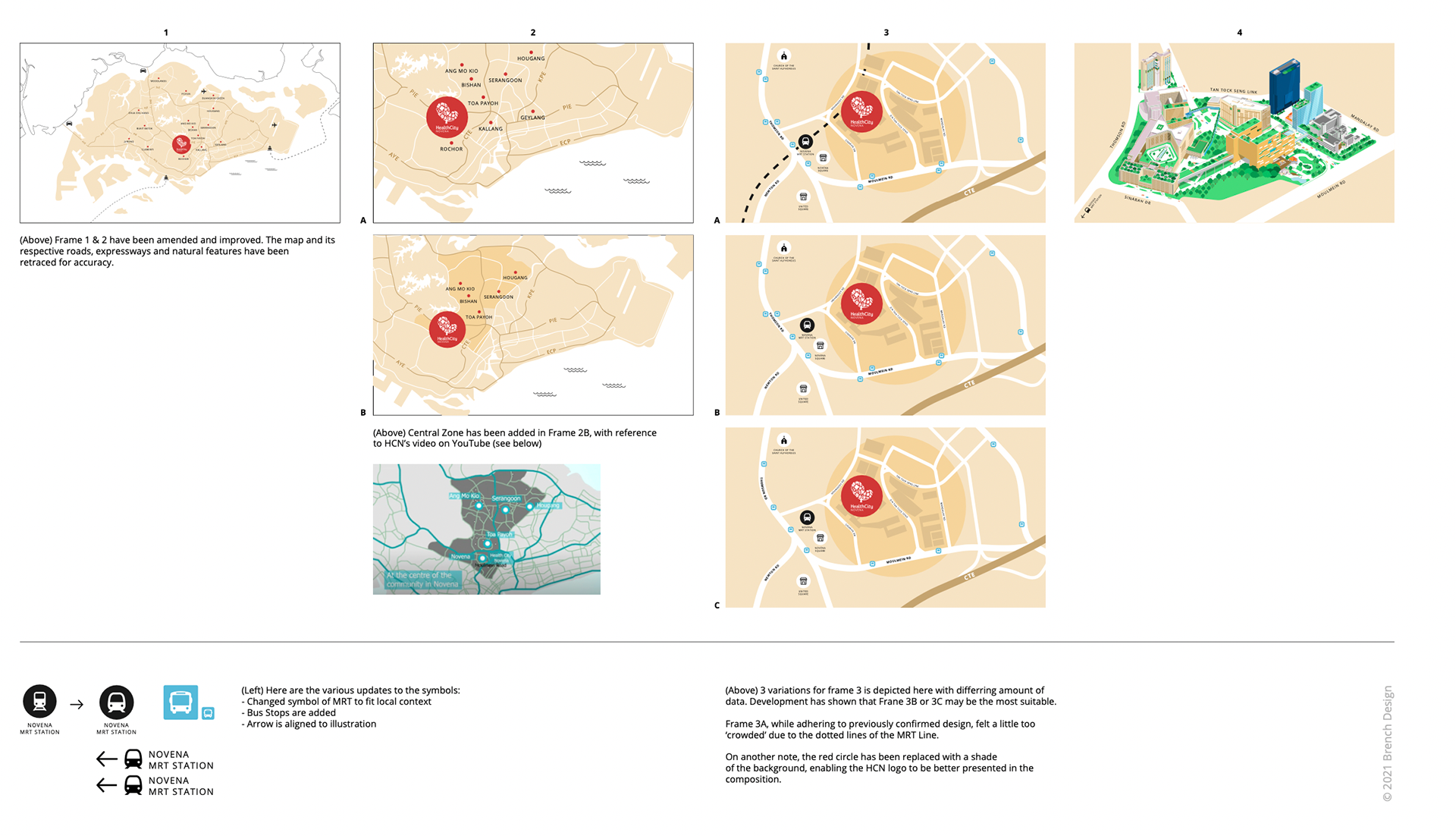
Once the main infographic was established, the remaining visual components were developed around the same system to create a cohesive experience throughout.
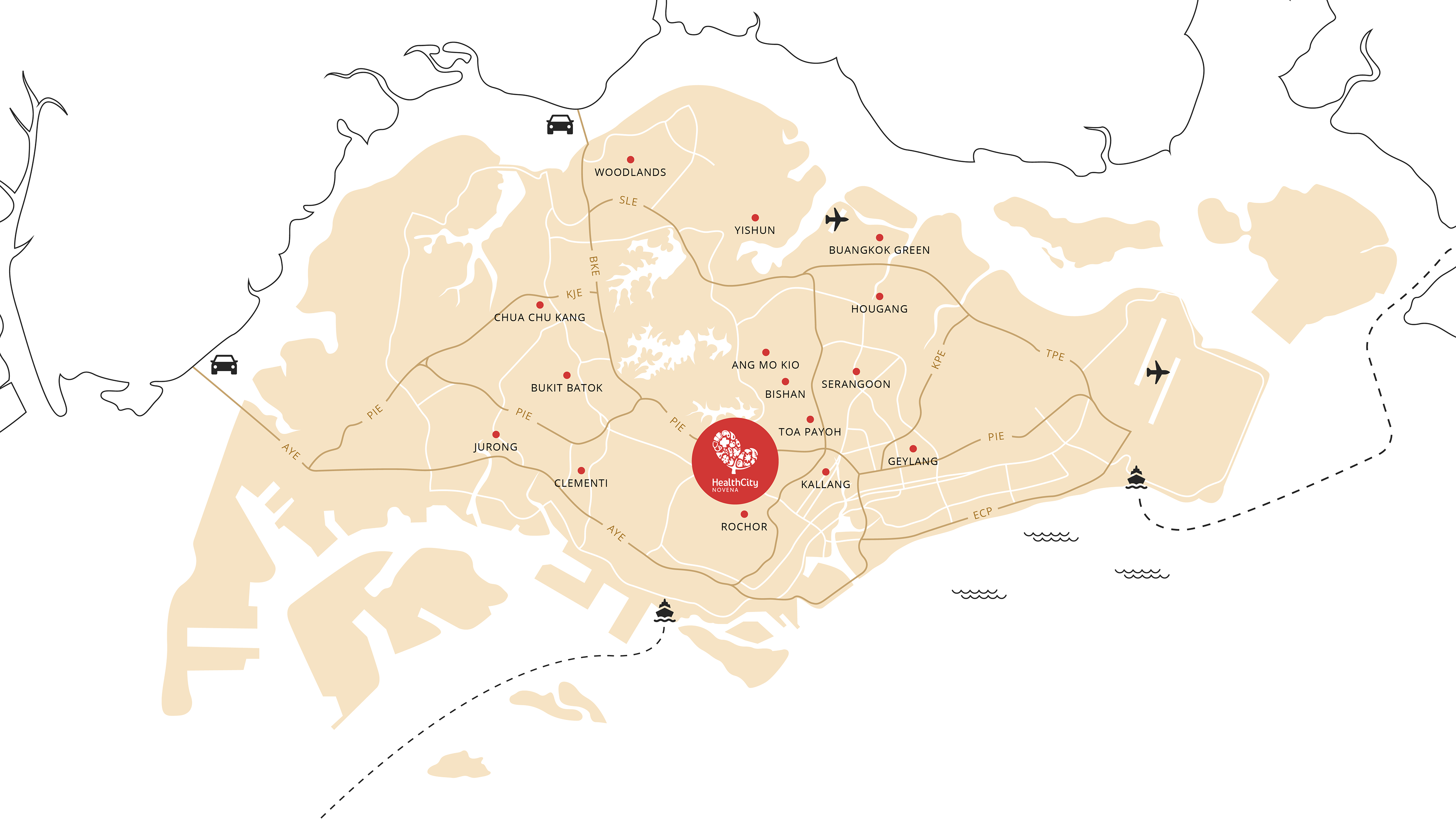
Scene 1 - Overview
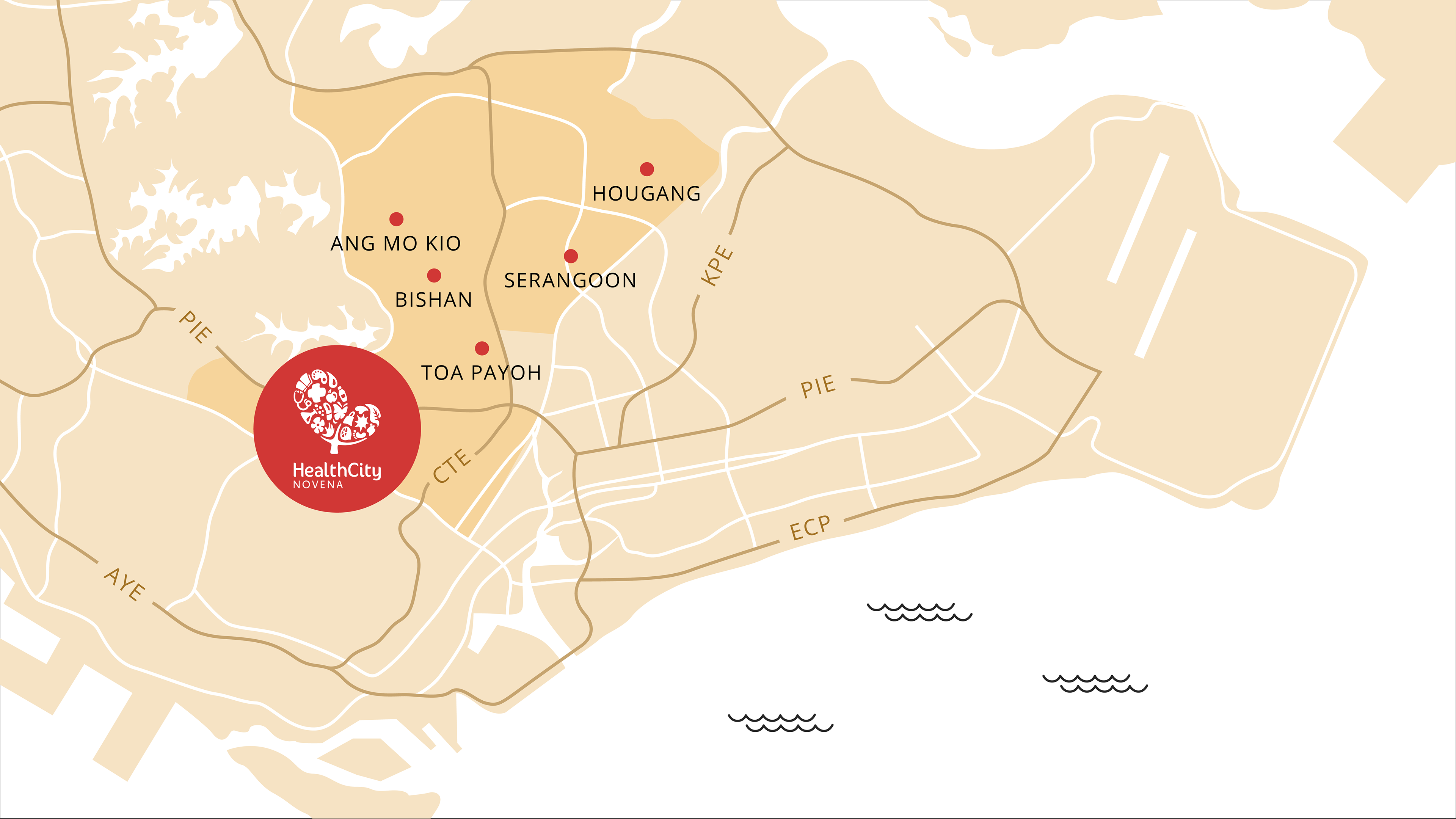
Scene 2 - Area around Health City Novena
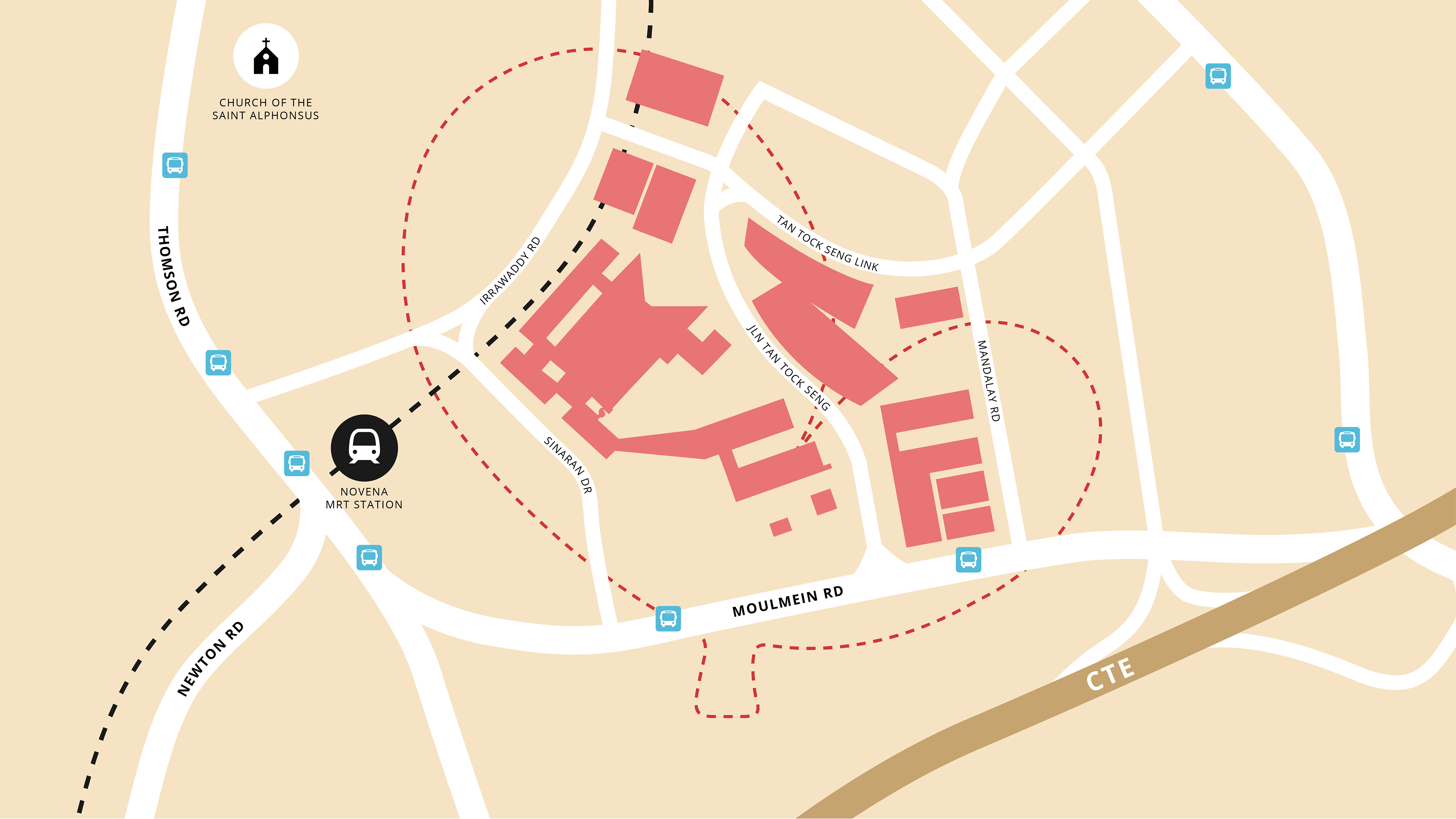
Scene 3 - Area within Health City Novena
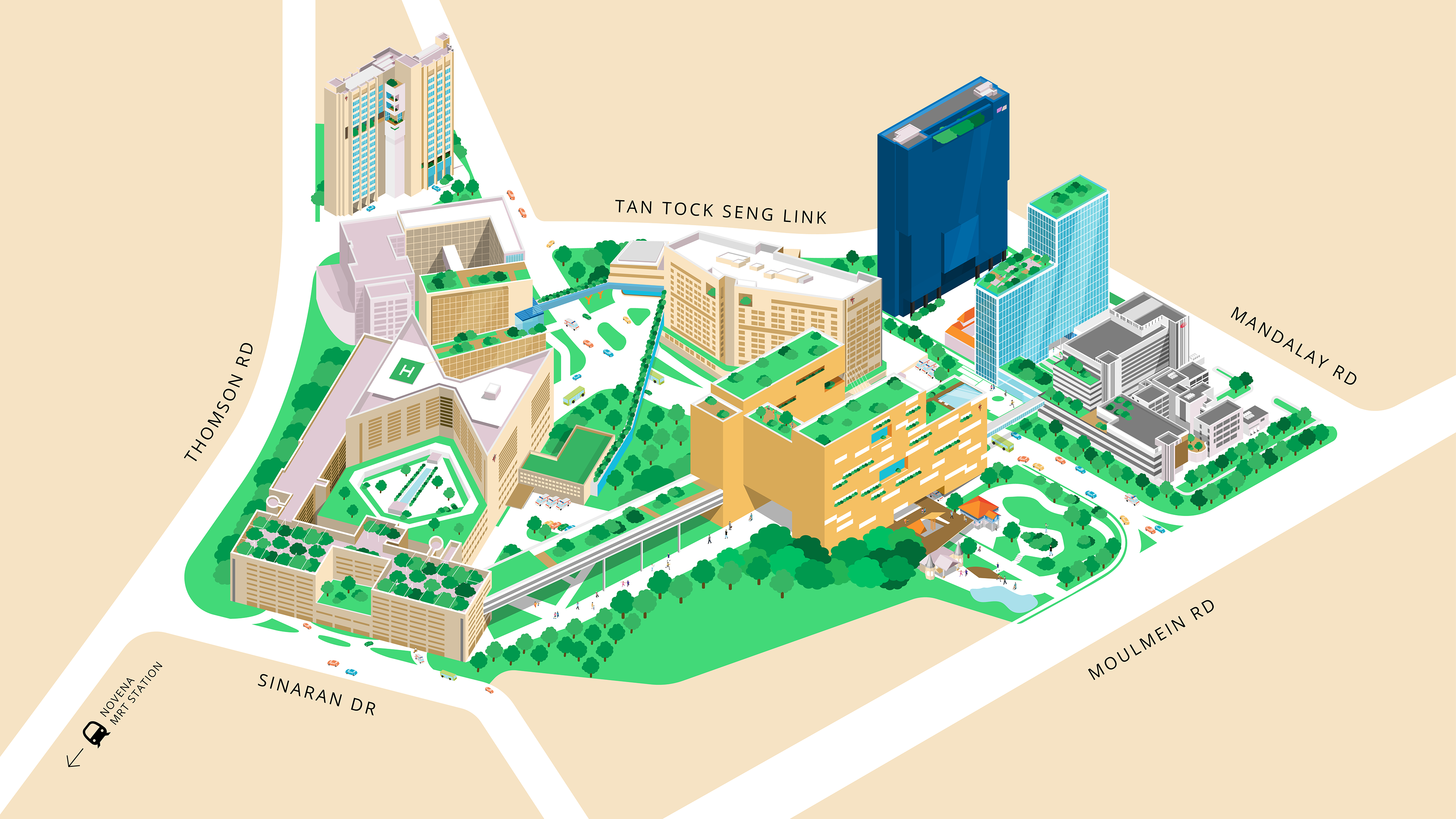
Scene 4 - Health City Novena in Isometric
Through several rounds of refinement and iteration, the different components came together to form the final interactive infographic — balancing detailed illustration with clear and accessible storytelling.