
SkipIt: A Healthy Living Mobile Application
UIUX, Digital | Concept Design
As part of my 5 year goal to become a T-shape UX designer, I signed up to join a UIUX course some time in 2021 to deepen my knowledge in the processes expected in the industry. At the end of the course, we had to create a product - such as an App. I chose to do a mobile application just so that I can apply what I have learnt into action.
The following slides present the work done leading up to the creation of the mobile app / product - SkipIt
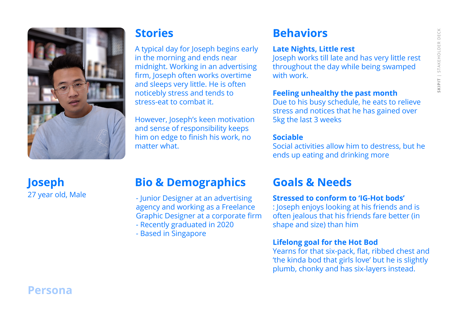
I begun the project by trying to understand the market and the users. Creating the problem statement, I listed out goals that provides me entry-points to further research. With interviews, I was able to understand users better, allowing me to distill and provide a more focussed problem statement.
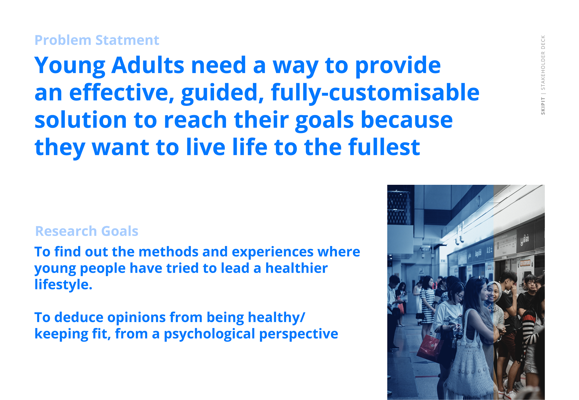
Distilled Problem Statement
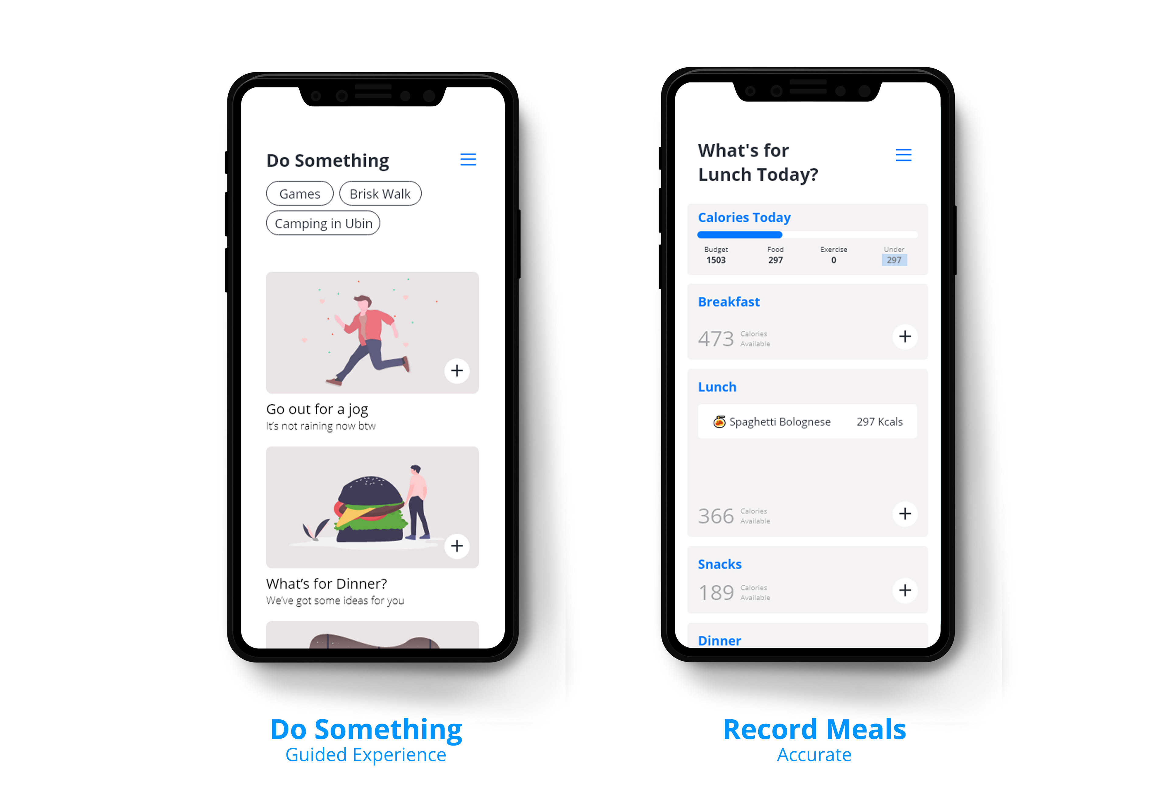
Young Adults need a way to adopt a healthy routine that is guided, customised and accurate to be healthier because they feel it’ll be nice to be better than before
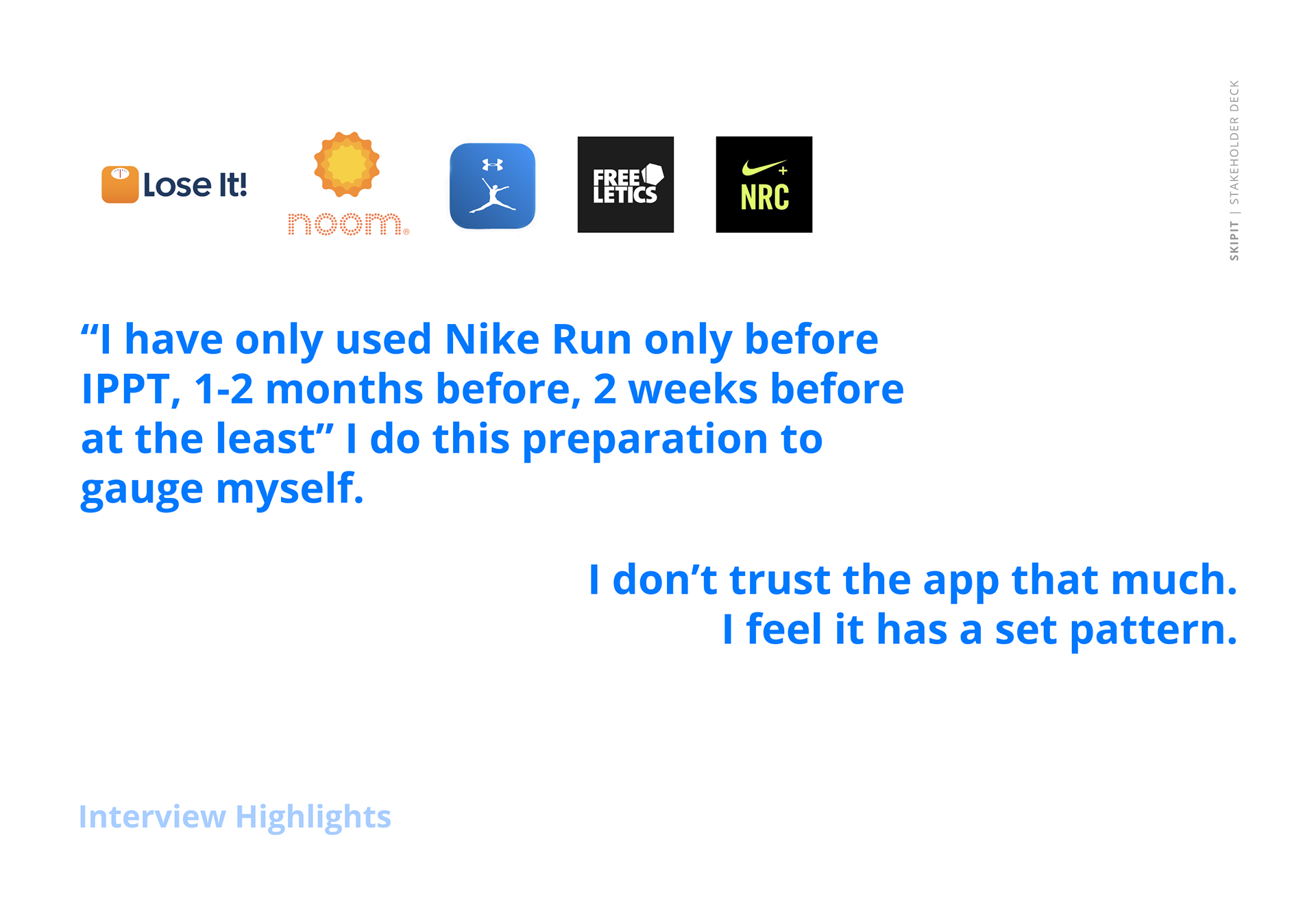
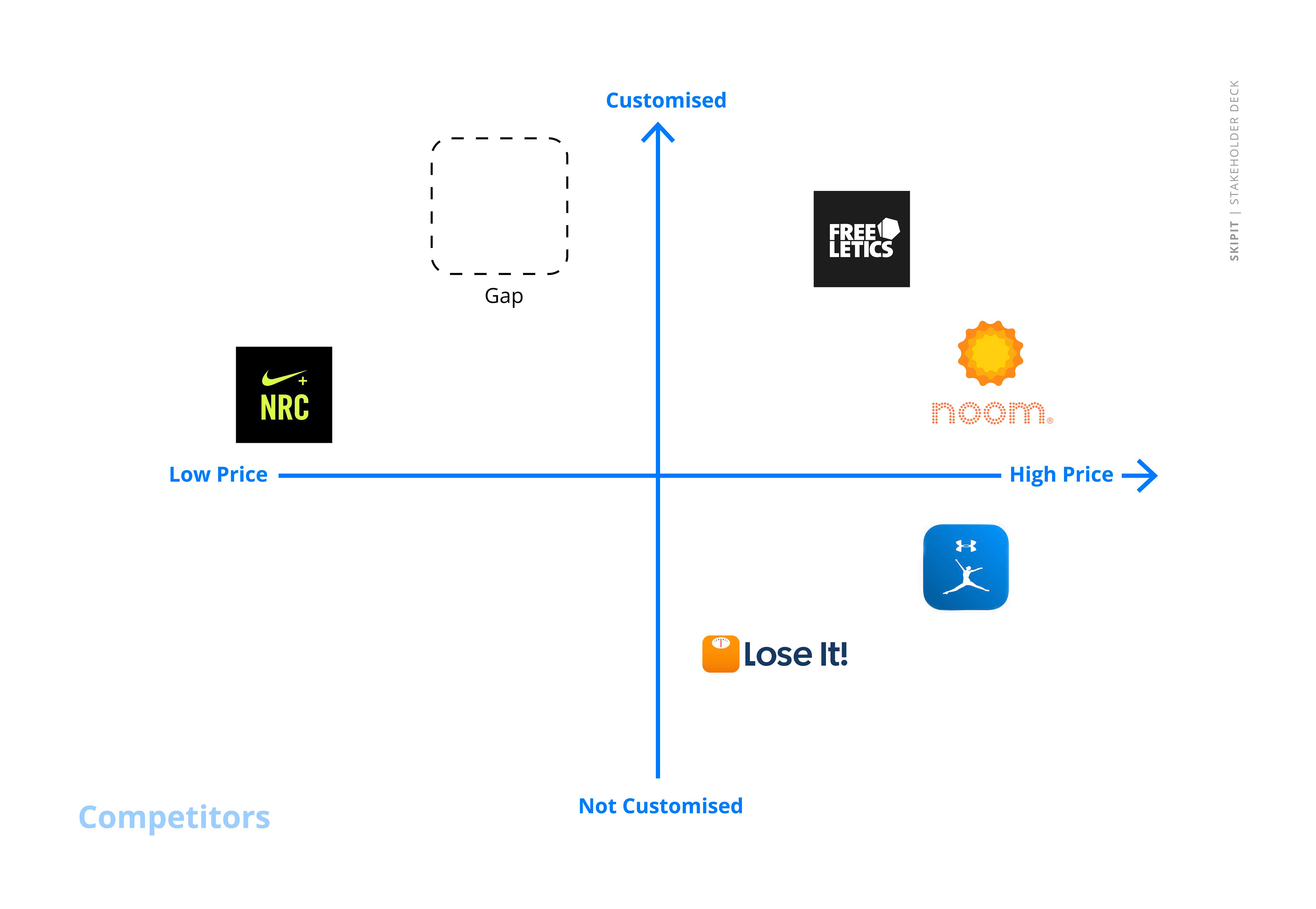
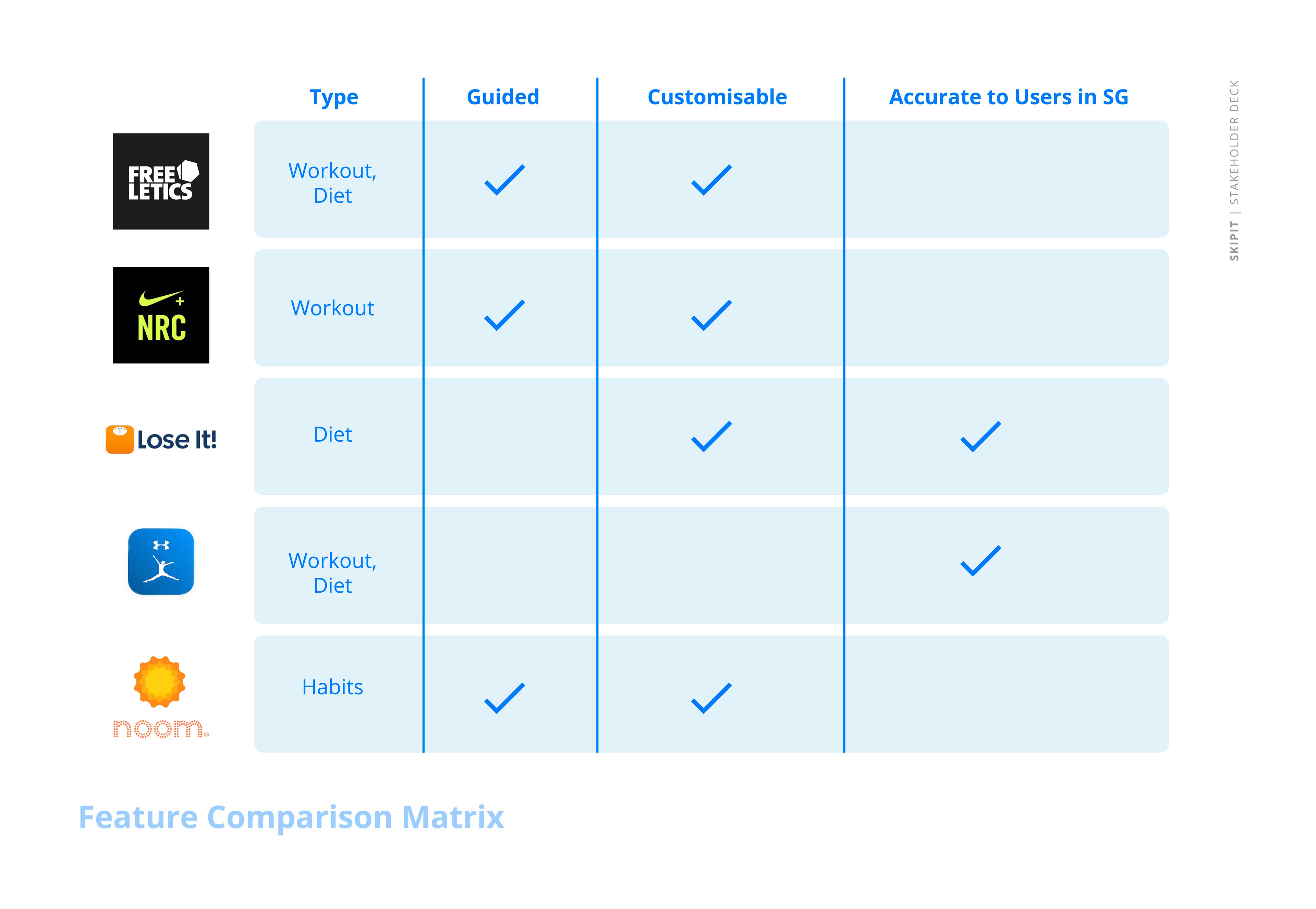
Market research allowed me to dive into the key functions of existing fitness applications. By comparing its functions to the problem statement, I found that only 2 out of 5 apps were accurate to users in Singapore.
Key Objective
With the research conducted, I established the key objective of the application, which is to provide young adults a platform to keep healthy so that they can live their life to the fullest.
Making use of the gap in the market, I believe the app could potentially be:
- Be accurate to Singapore users
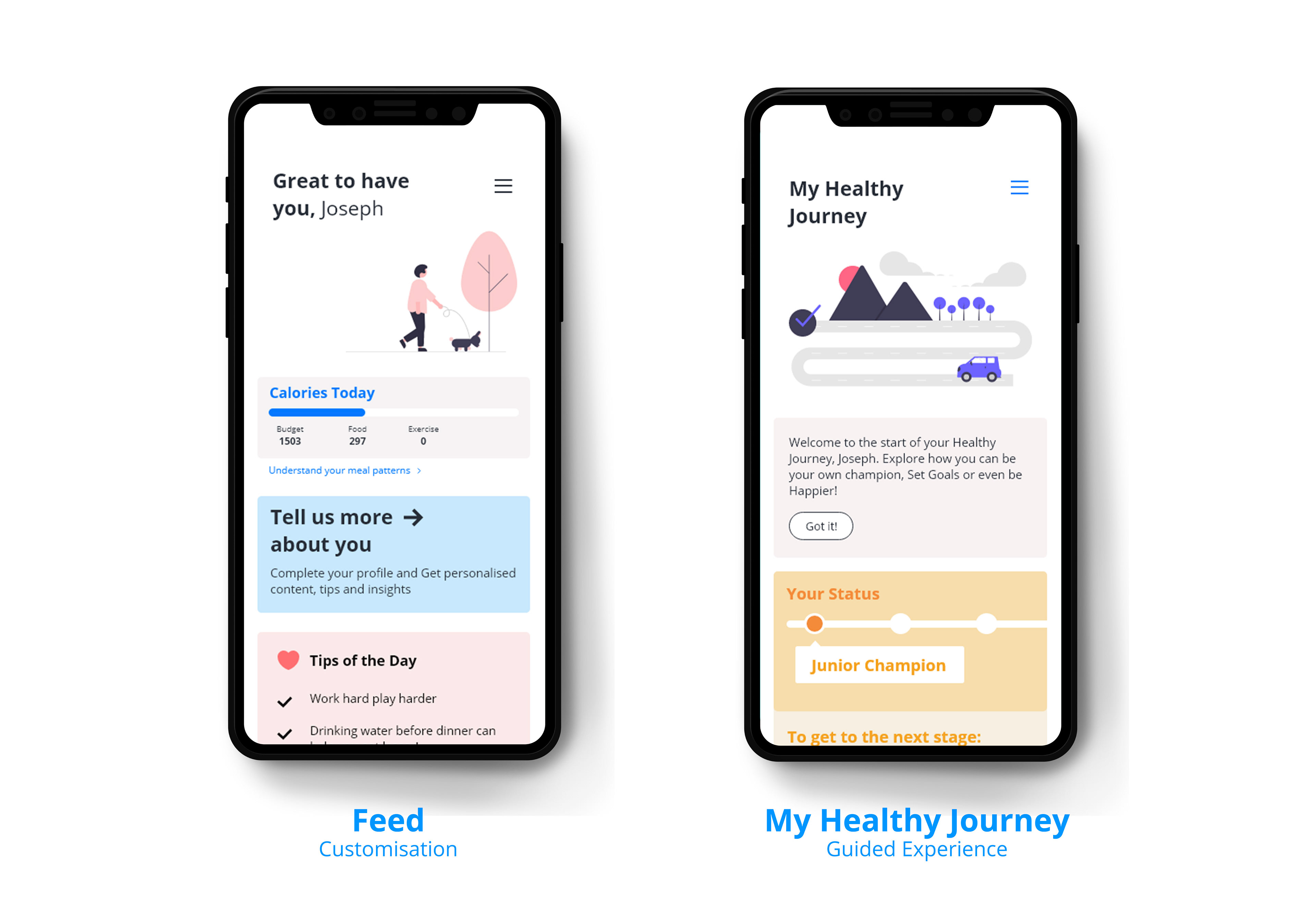
- Be guided Health Journey
- Customisable Plans for all
- Reach your goal at your own pace
Task Flows, Feature Prioritisation Matrix
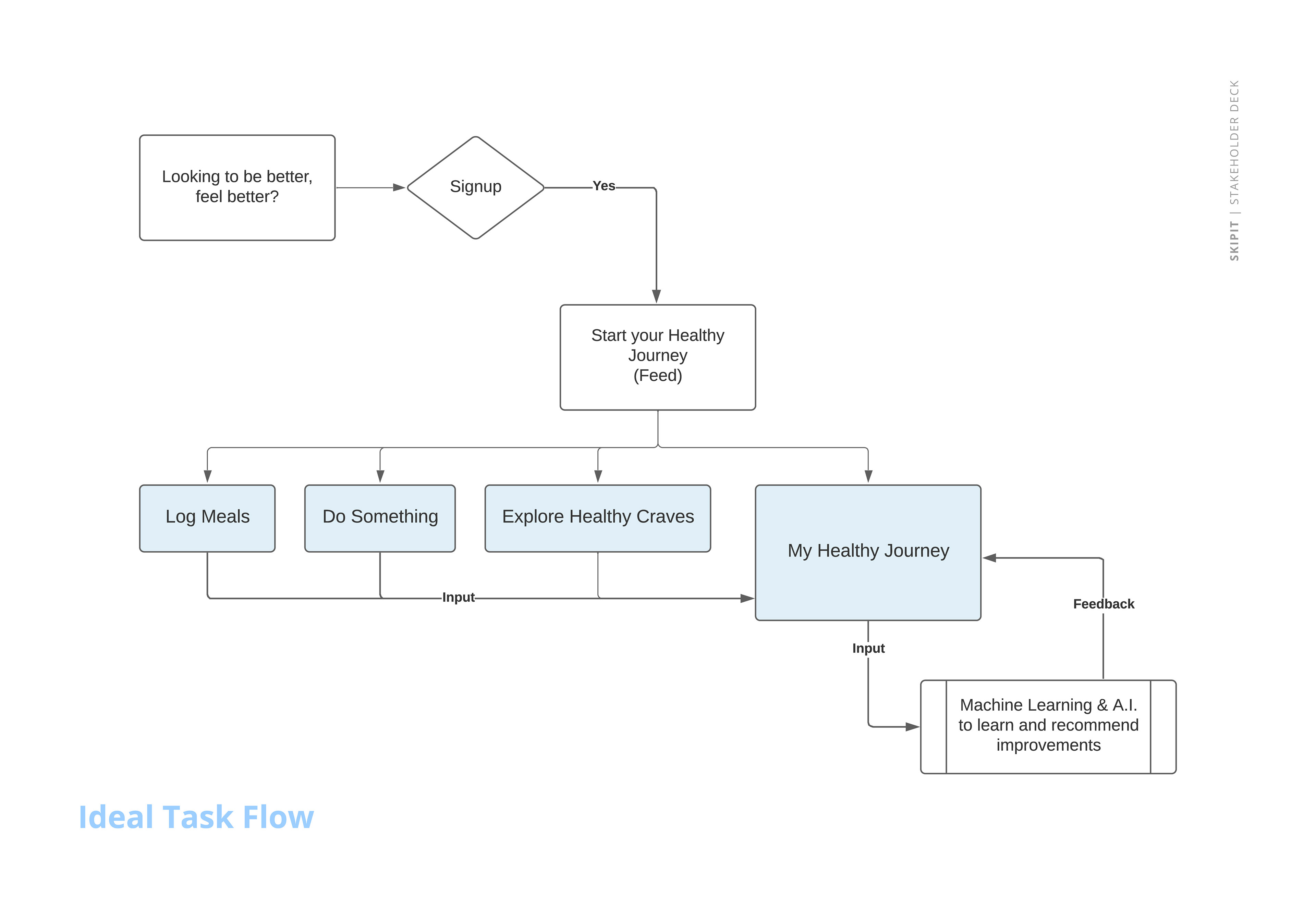
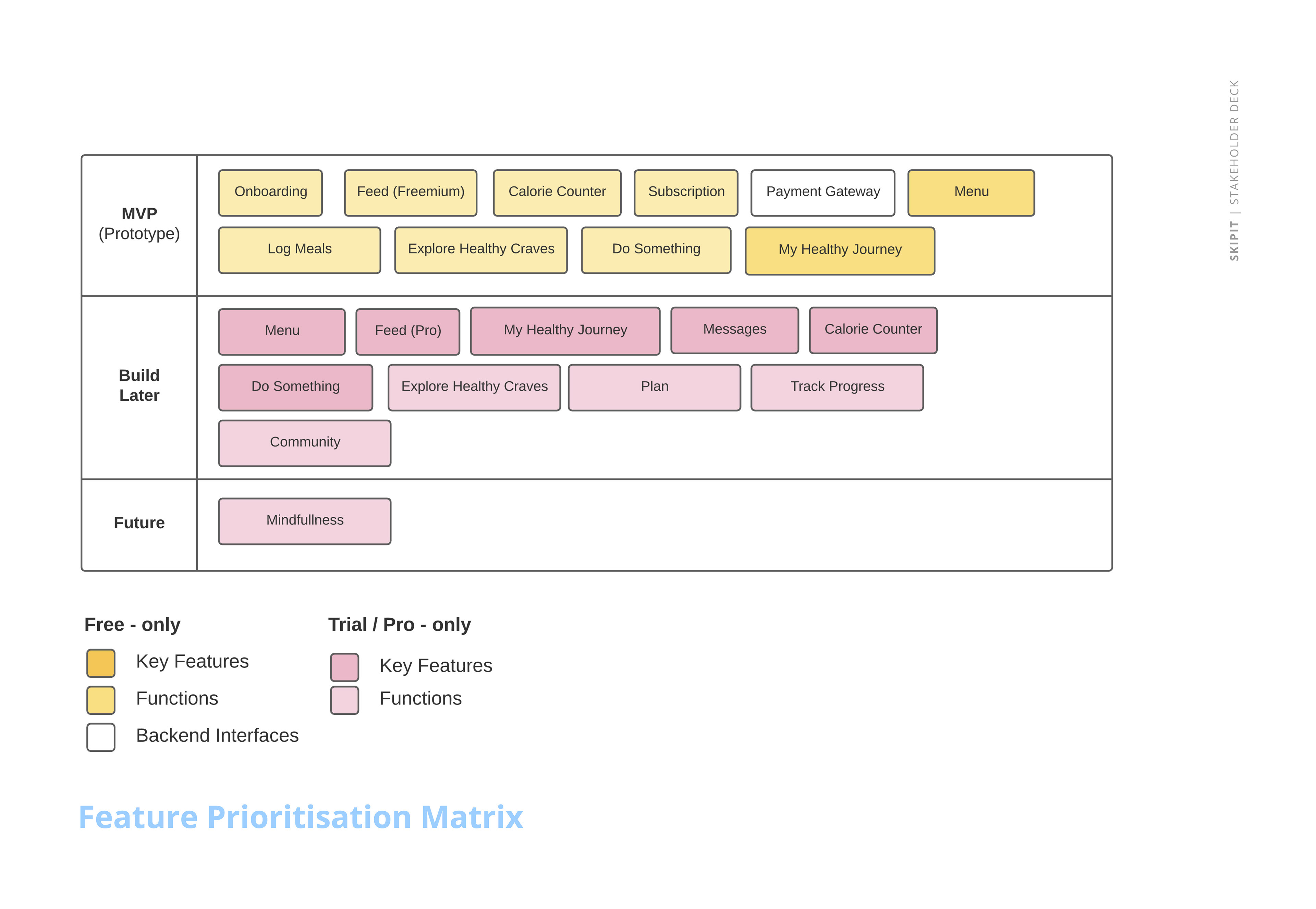
Placing myself in the user's point of view, task flows were created to predict ideal and possible ways users would use the app. This also allowed me to tinker on features I'd include in the app - and sorting them based on priority to reach the minimum viable product (MVP)
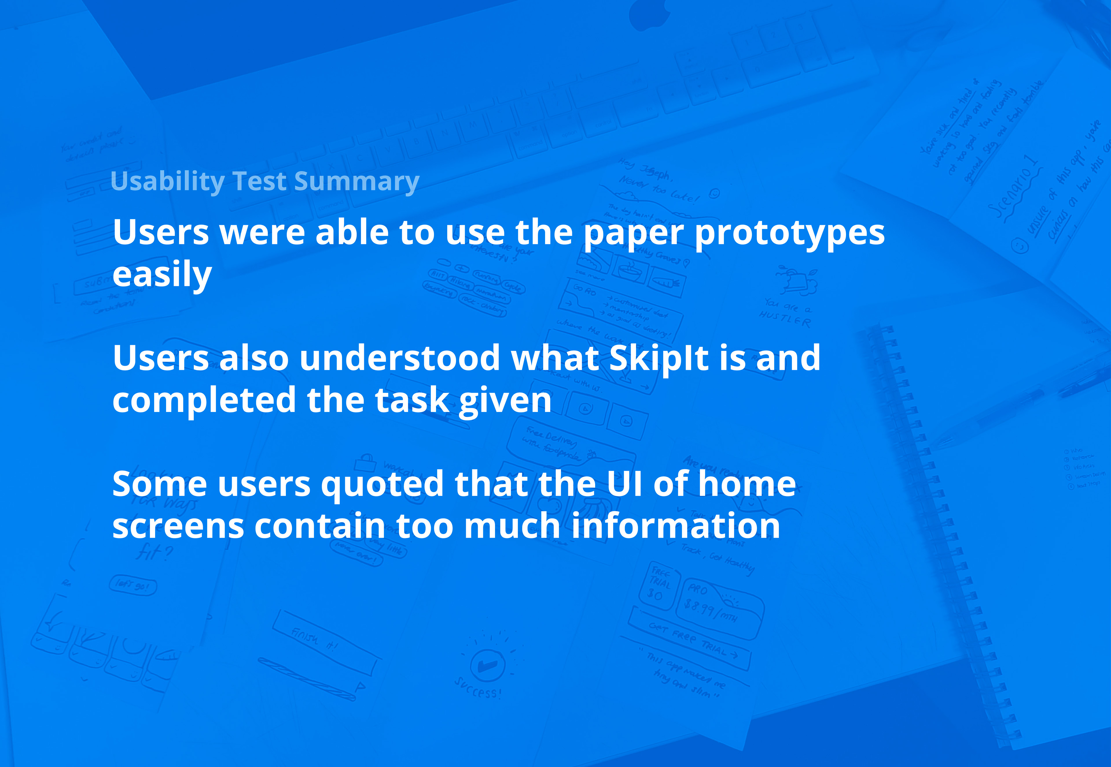
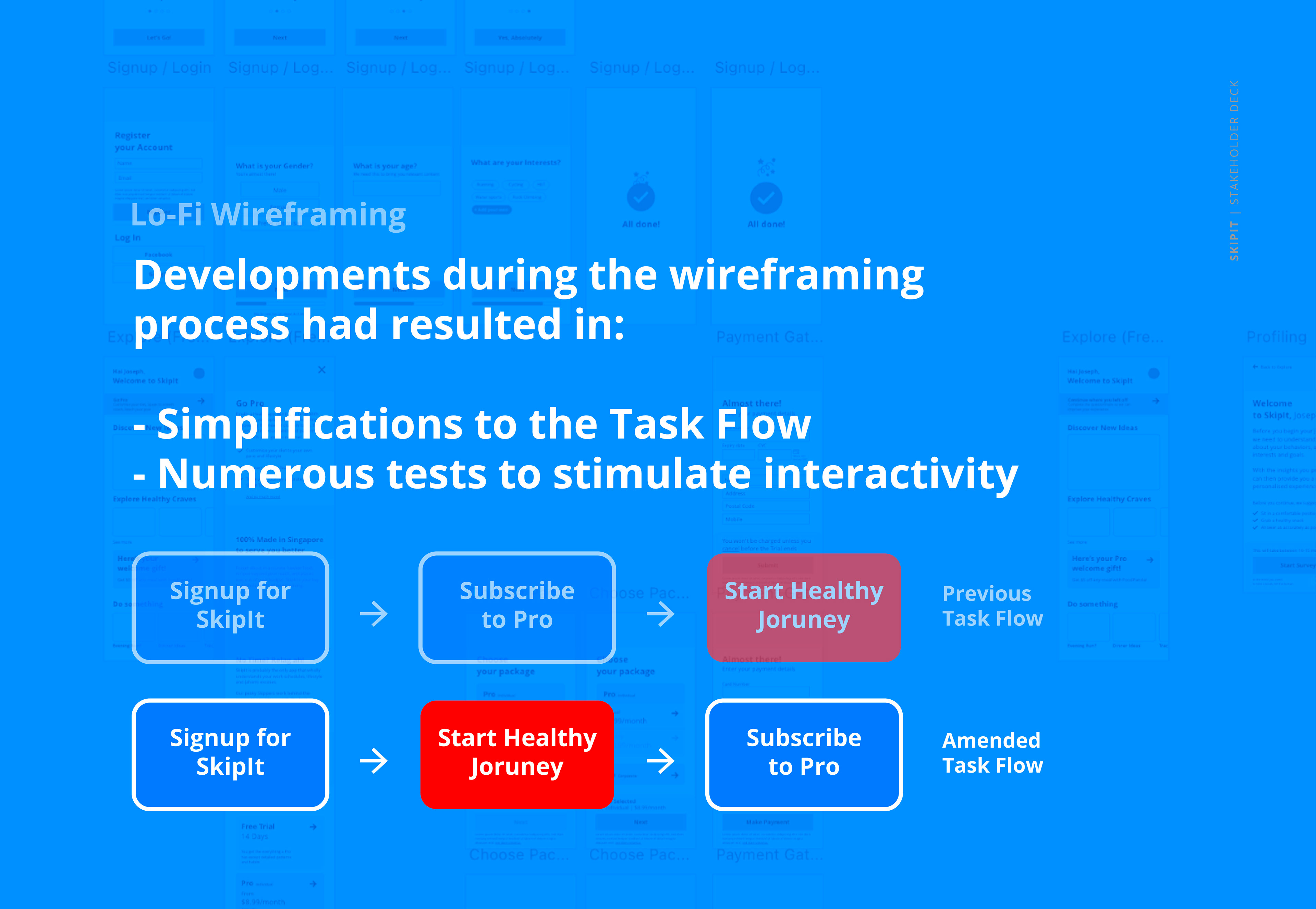
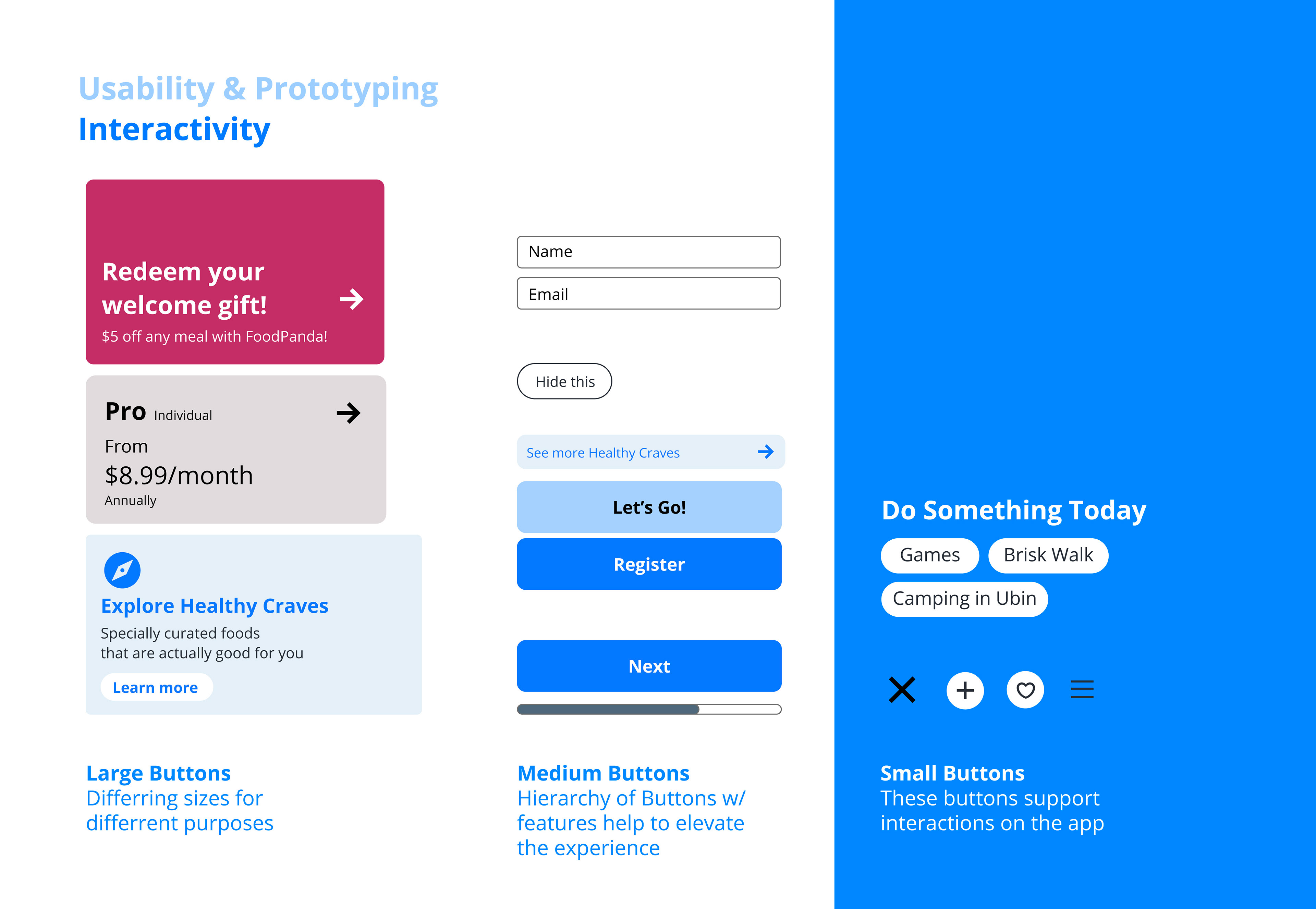
Prototyping & Usability Tests
Creating paper prototypes, potential users were asked to use the app with specific goals. This allowed me to understand how the design reacts with the user and gave me another opportunity to tweak some processes to accommodate my users - such as simplifying the task flow.
High Fidelity prototypes were then created using Adobe XD and tested again to test the product's usability.
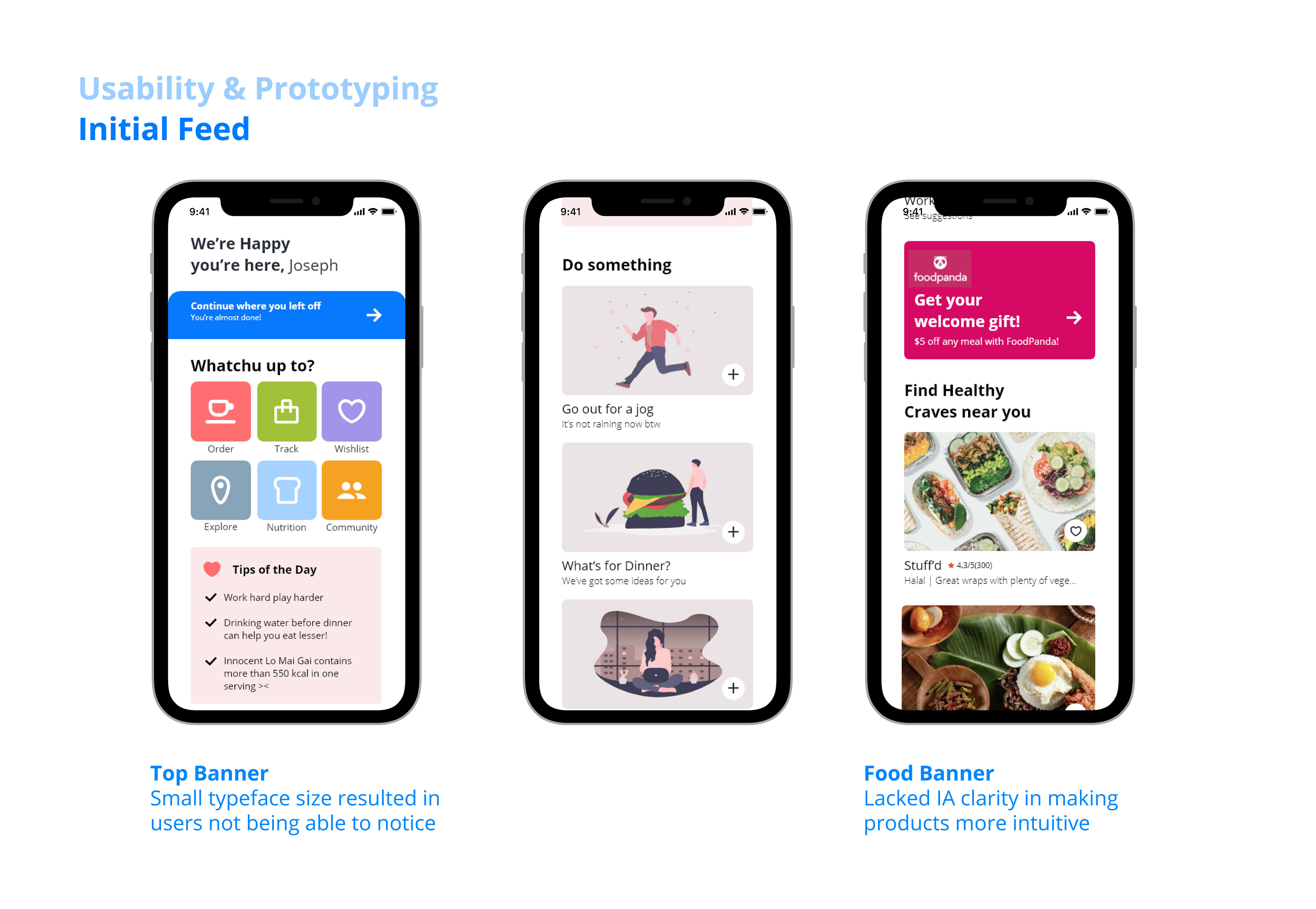
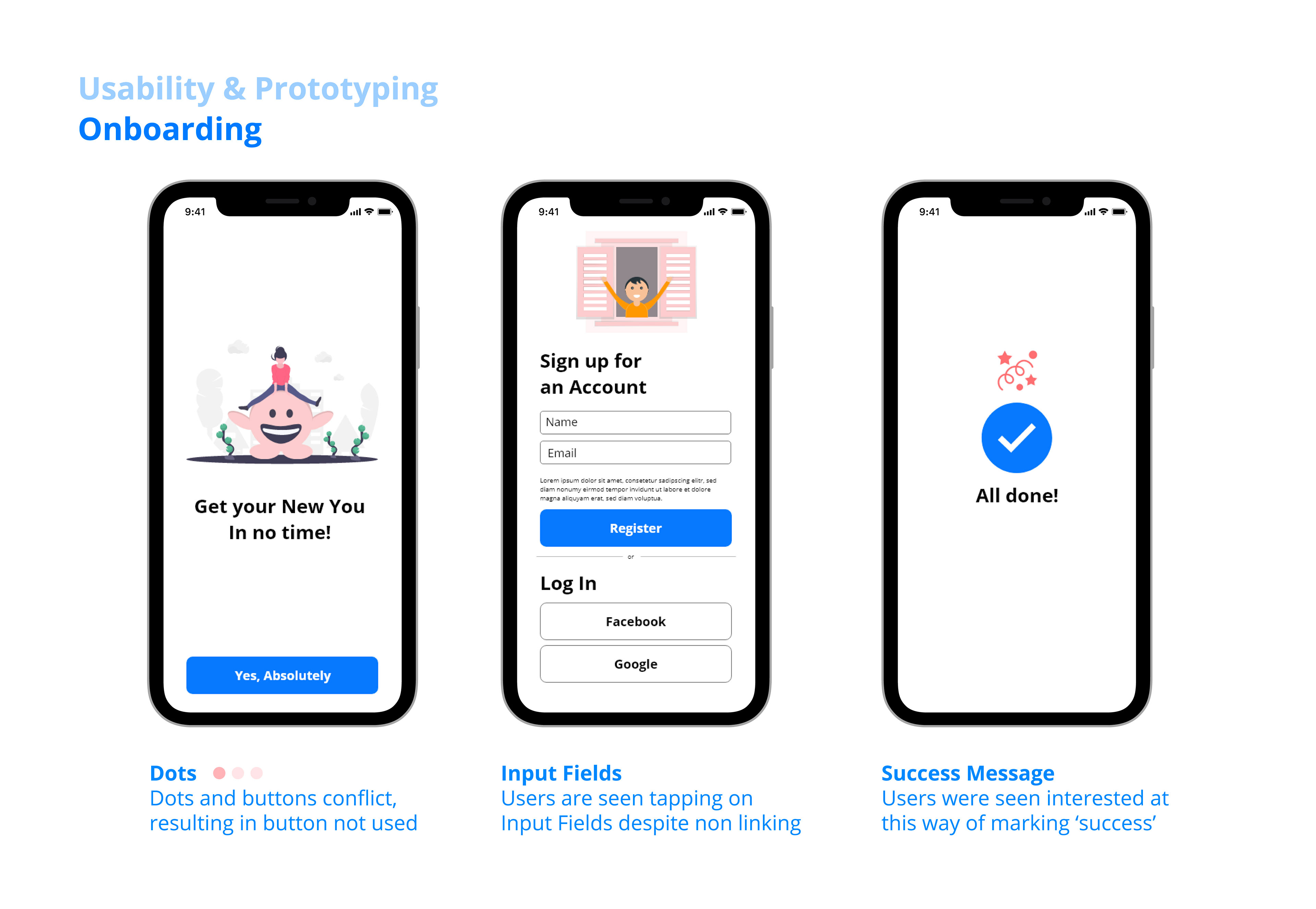
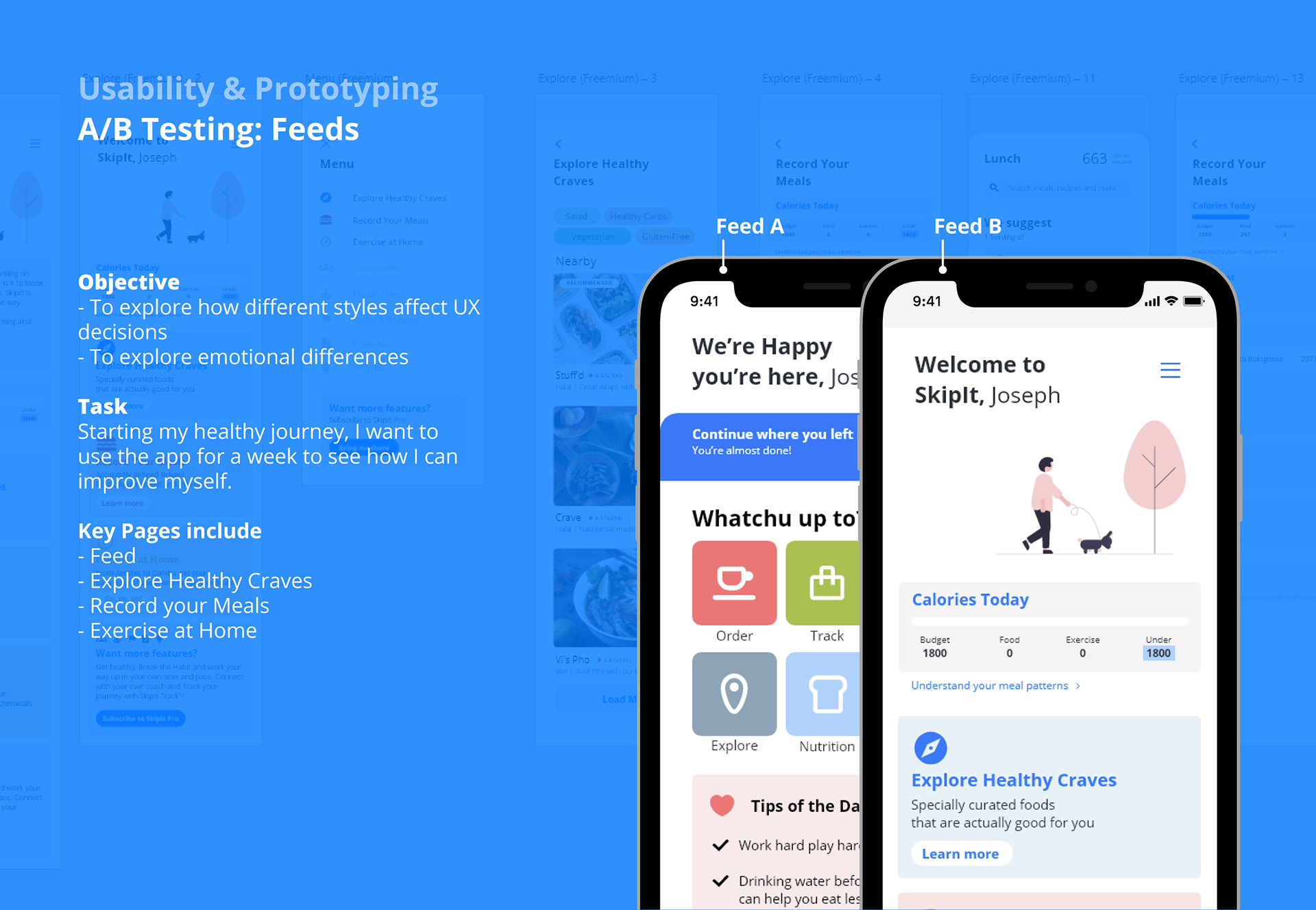
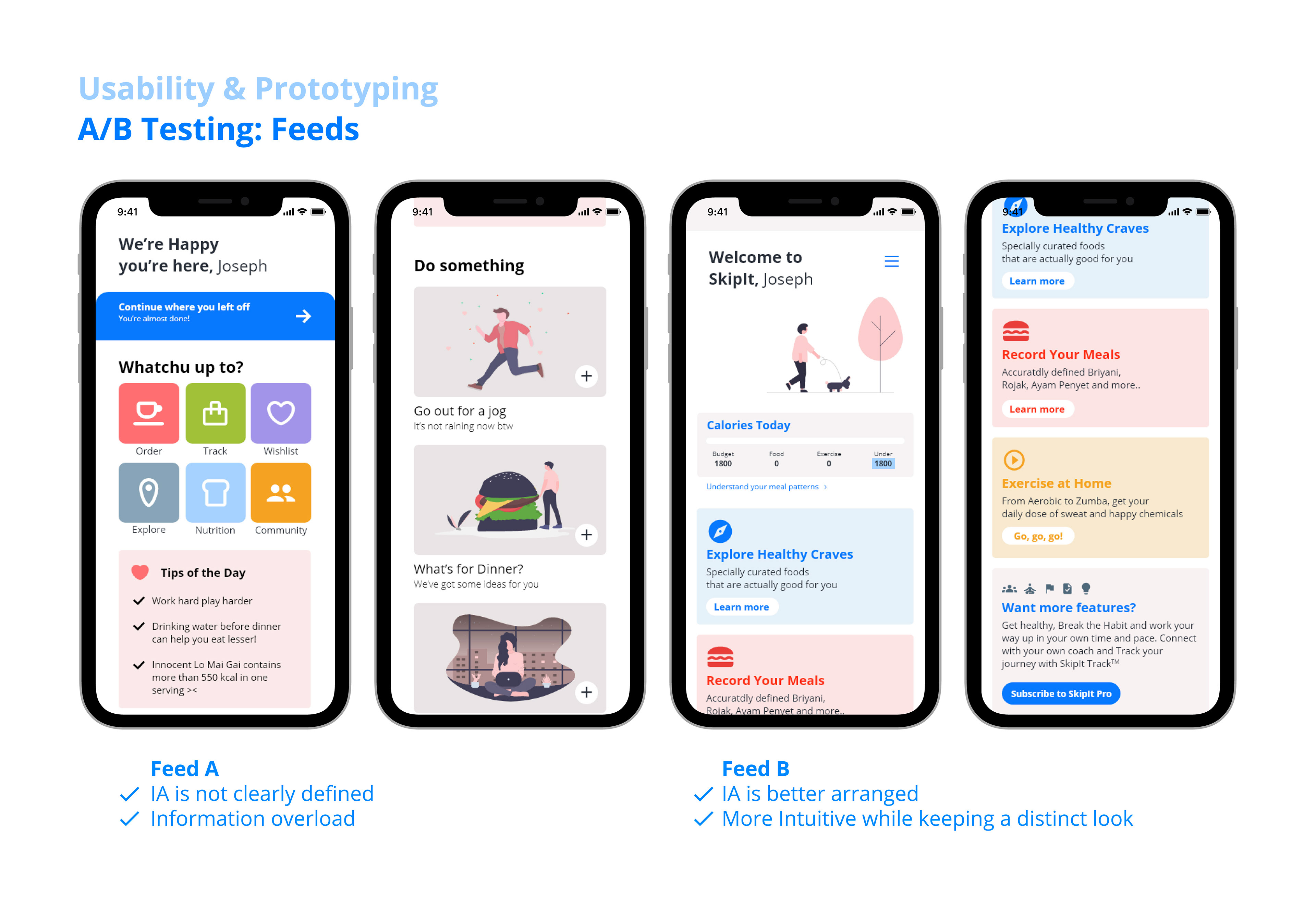
A/B Usability Tests
These tests allowed me to better scrutinise the way users interact with the product. Through the use of modular and simple visuals, the UI is designed to feel happy, lively yet easy to use. I've also taken this opportunity to introduce some copy that reflects the user's age and lifestyle, so as to fulfil user needs.
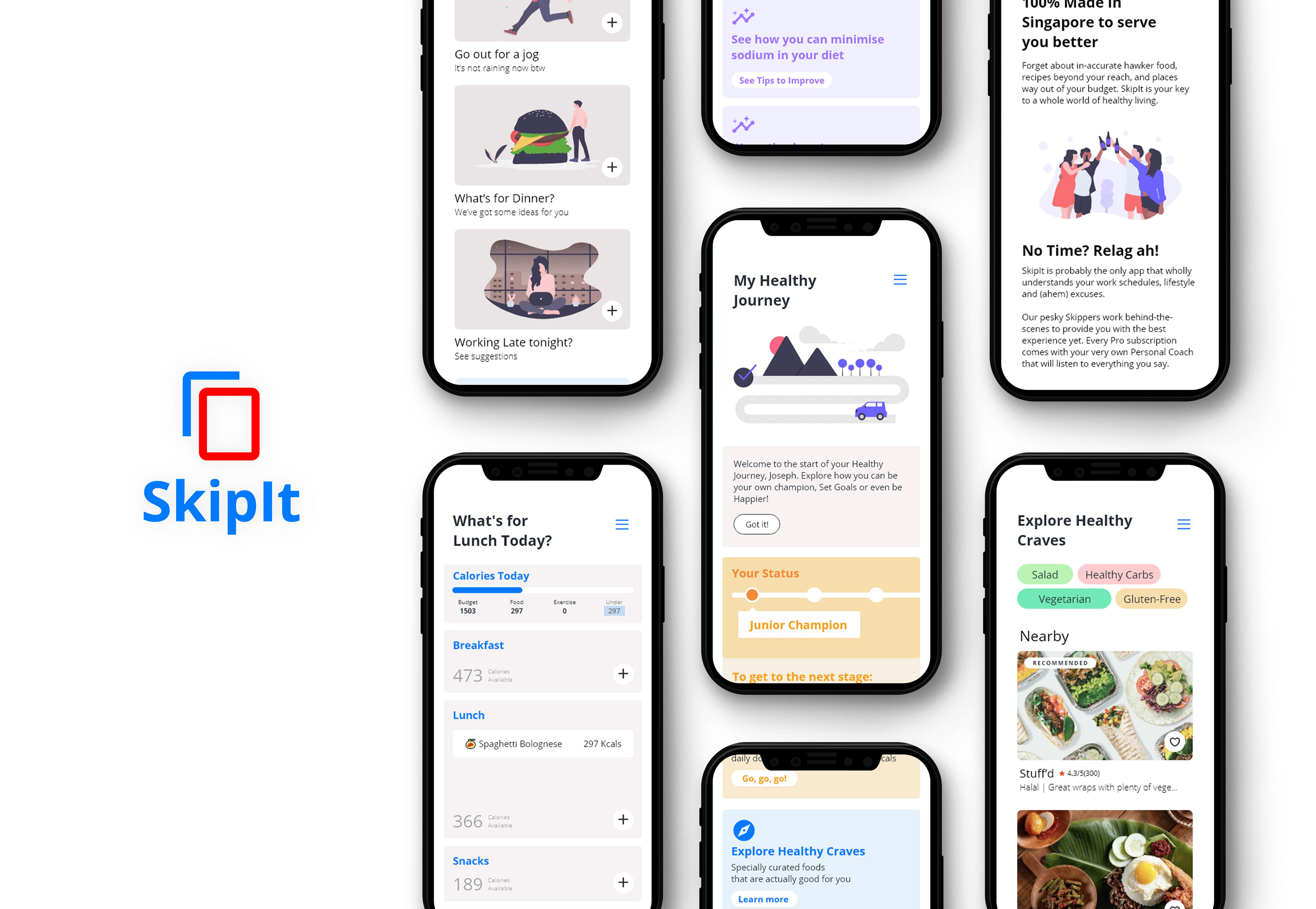
Completion of SkipIt
After some A/B Usability Testings were completed, the product was ready to be launched. Below you'll find the app and its key features, designed to realise user goals and plug a gap in the market.

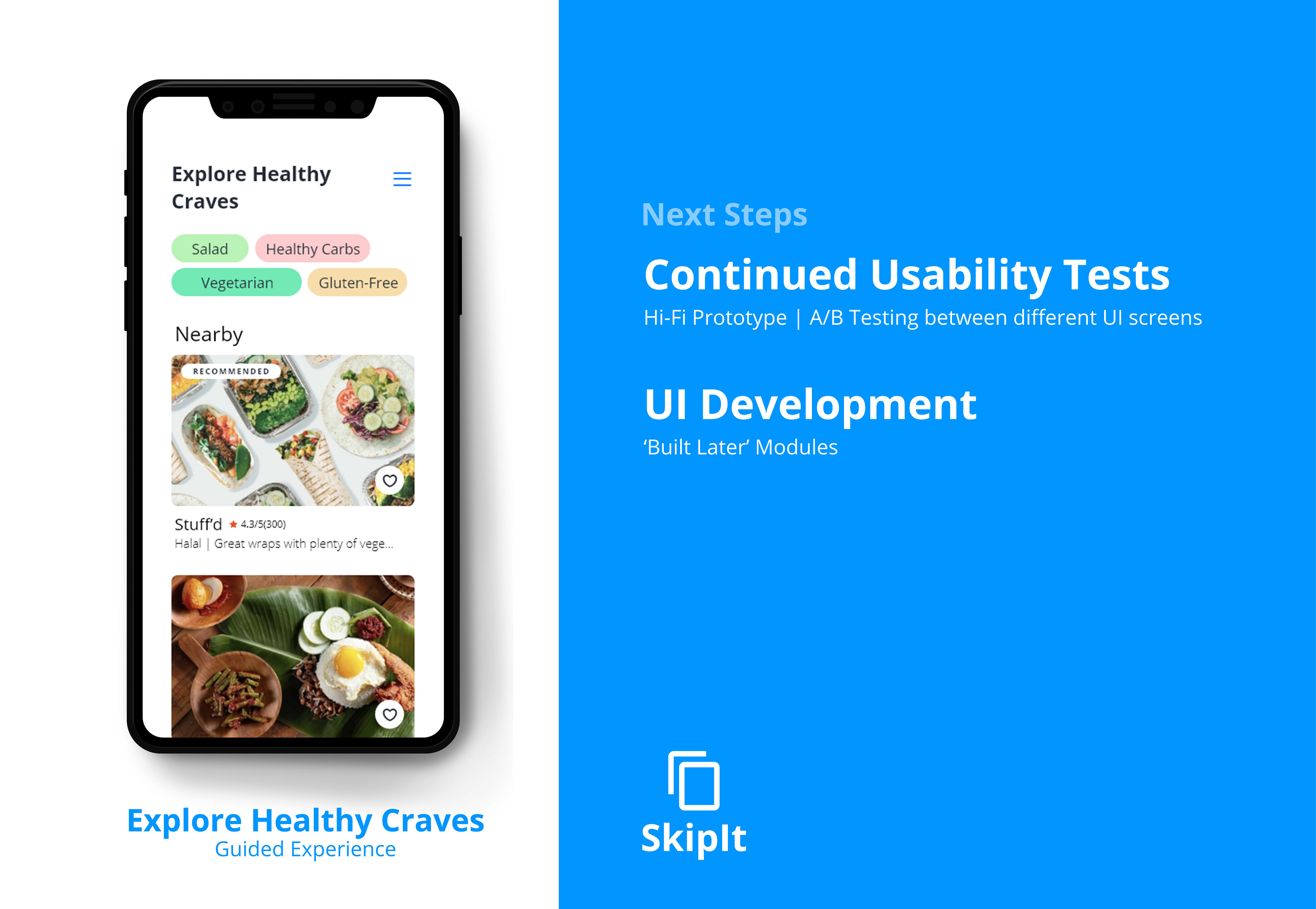
Navigate through the mockup below!
About the course
User Experience (UX) and User Interface (UI): An Accelerated Programme was held at Lasalle College of the Arts, providing a 6 day sprint (8-13 March 2021) from UX research to Prototyping. Through this course, I have learnt to be a better UX design and be aware in putting users at the heart of all forms of design.

