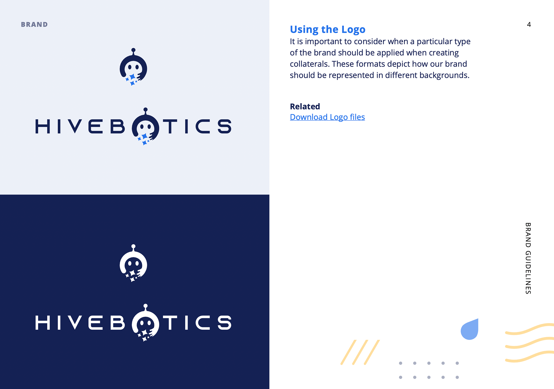
Screencap from the Brand Book
Being a tech-automation related company, the logo is designed to reflect purity, futurism, cleanliness and artificial intelligence. This is done through the combination of a futuristic typeface and an icon that represents the functionalities of HiveBotics
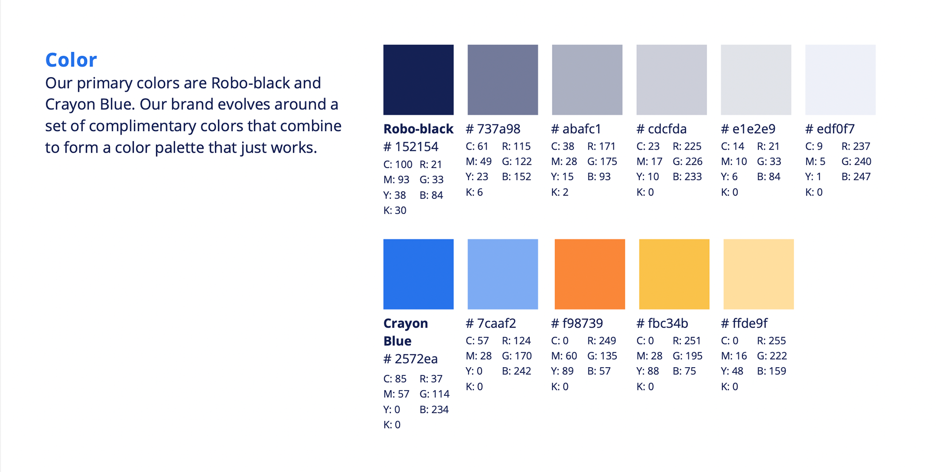
To maintain a consistent visual identity, a palette of deep navy, technology-inspired blue and vibrant orange was selected to reflect HiveBotics’ positioning. The combination balances a sleek, technology-driven aesthetic with warmth and energy, resulting in a brand that feels both innovative and human.
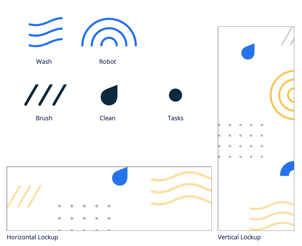
Supplementary illustrations were developed to visually represent the product’s various functions. These simple, literal graphic elements can be combined into flexible visual lockups and applied consistently across different brand collaterals, making the identity easier to use and maintain.
Each element draws from the physical motion of its respective cleaning function. For instance, flowing wavy lines represent washing, referencing the movement of water, while thick diagonal strokes represent brushing, reflecting the repetitive motion and physical action of scrubbing.
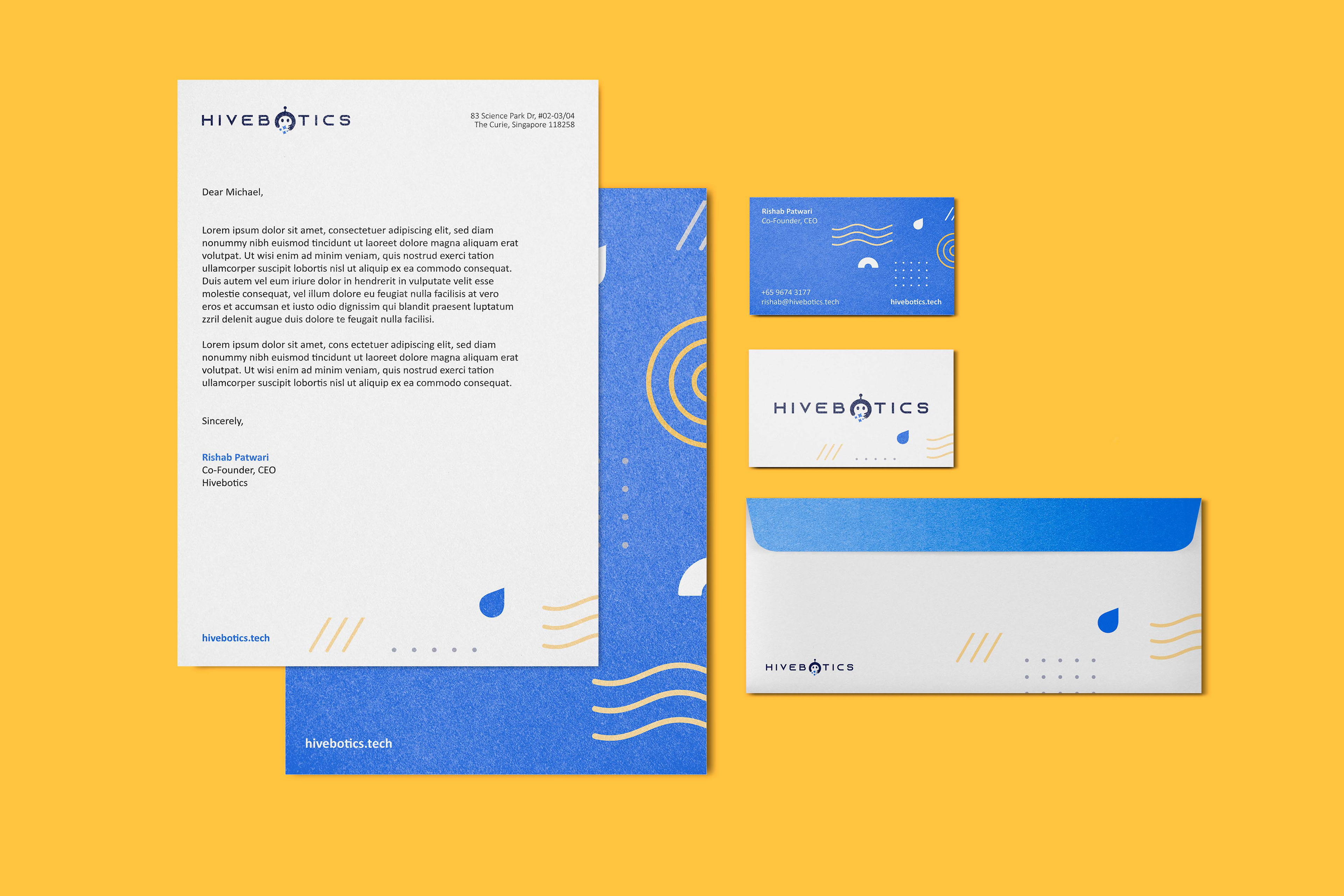
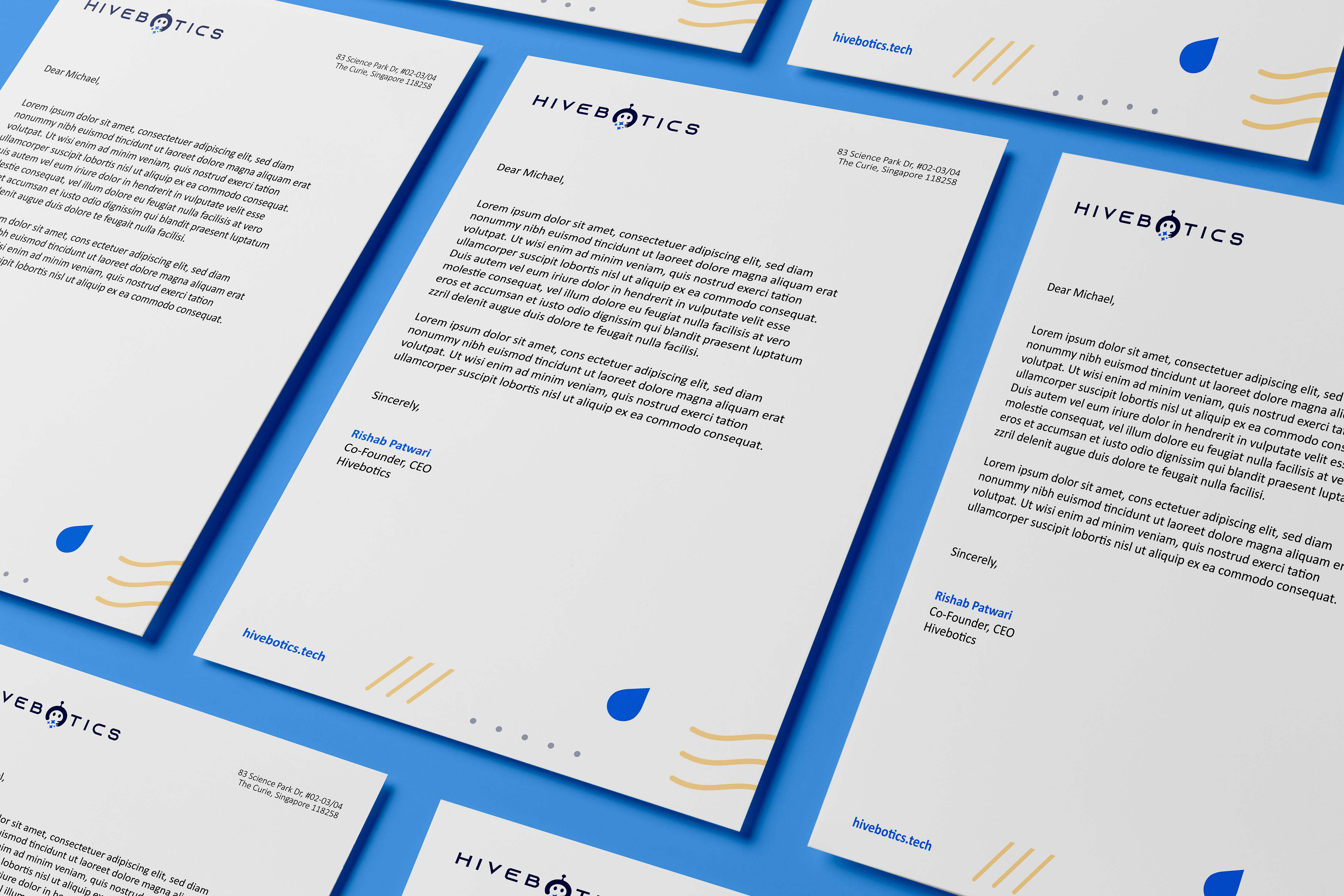
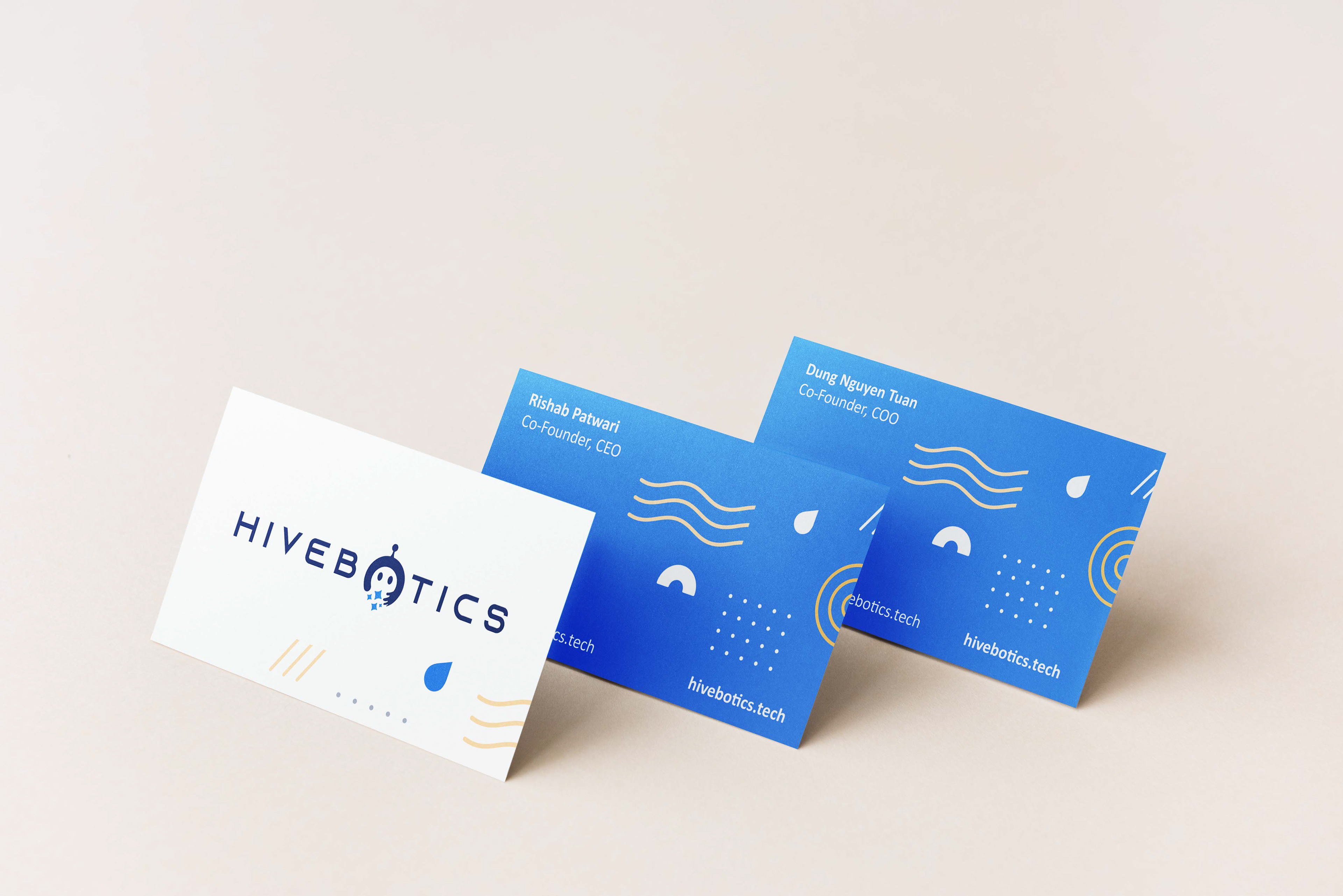
Together, the HiveBotics brand balances its technological and humanistic qualities, creating an identity that reflects both innovation and purpose.