
ASPaC Meiji Fresh Milk
BA Design Communication (Level 2) / For submission to ASPaC 2018
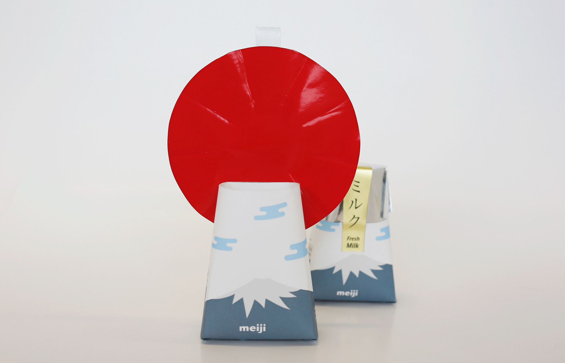
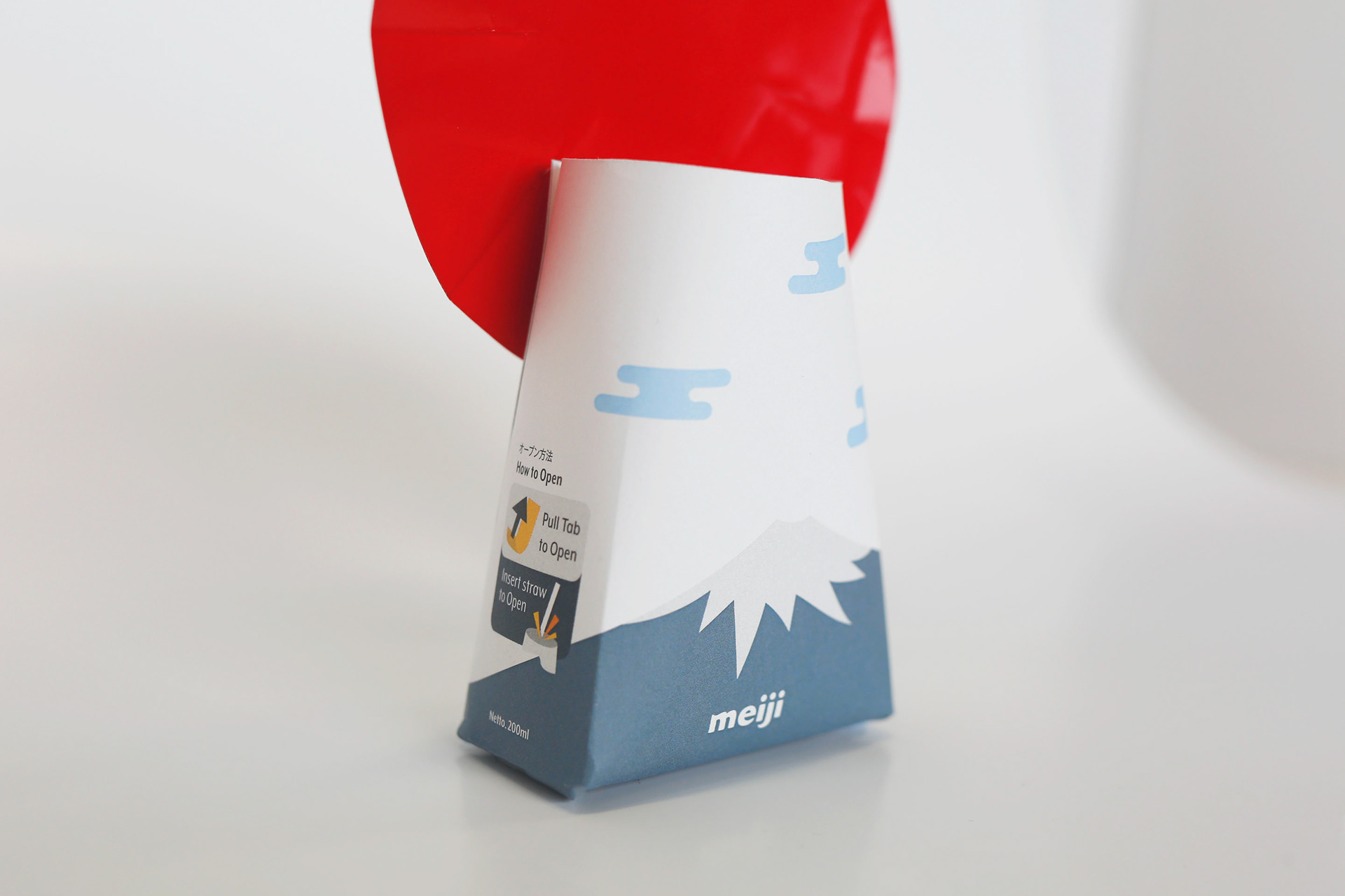
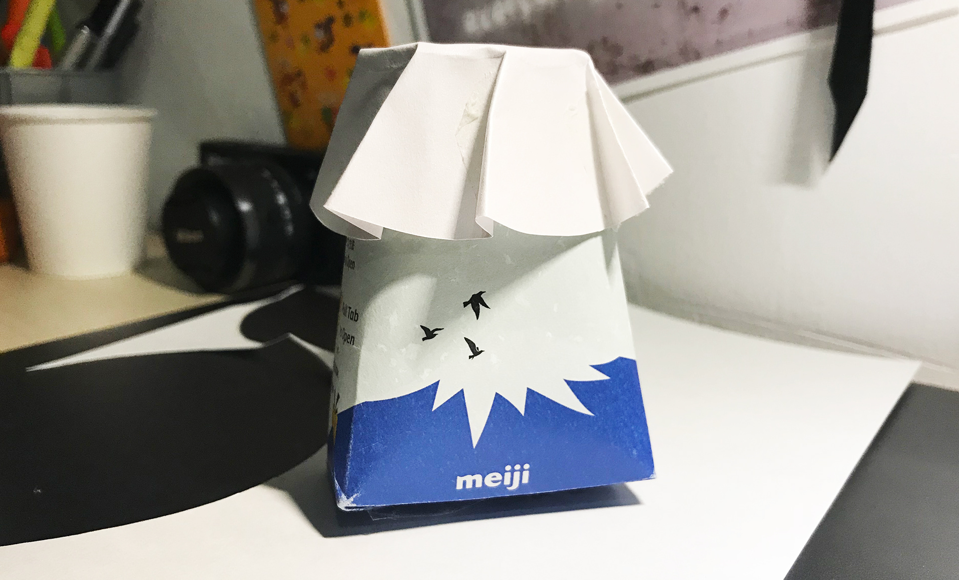
Mount Fuji, a quintessential part of Japan’s Culture, inspires the package’s form and branding. Represented in the Meiji Brand, the 200ML package is made for Fresh Cow Milk and designed with user experience while taking care of the environment. Purposed for convenience stores, it enables the user to open the lid with one pull, where the foil cover fully unfolds to form the shape of a Red Sun.
Find out more about the development process below.
Development Process
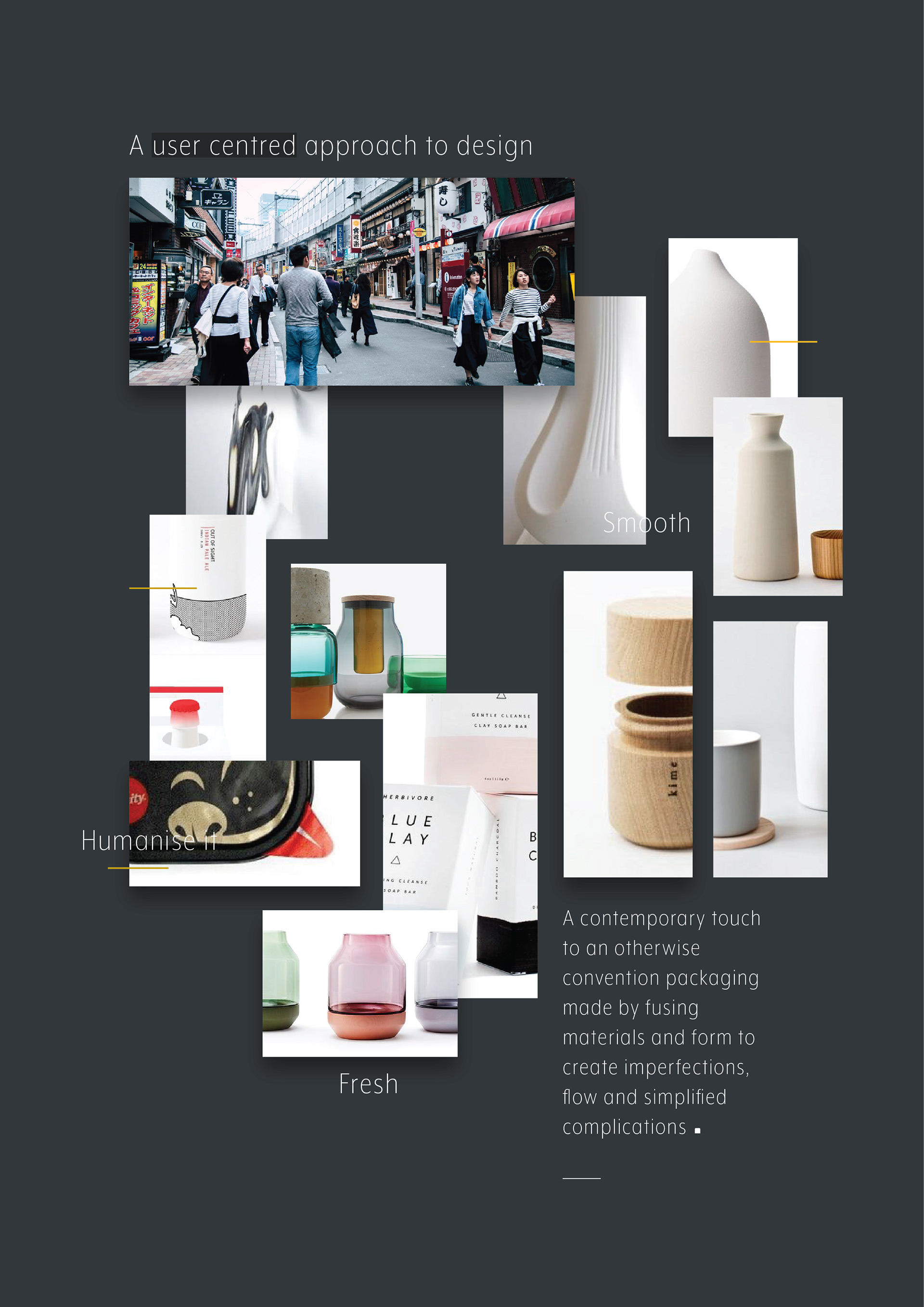
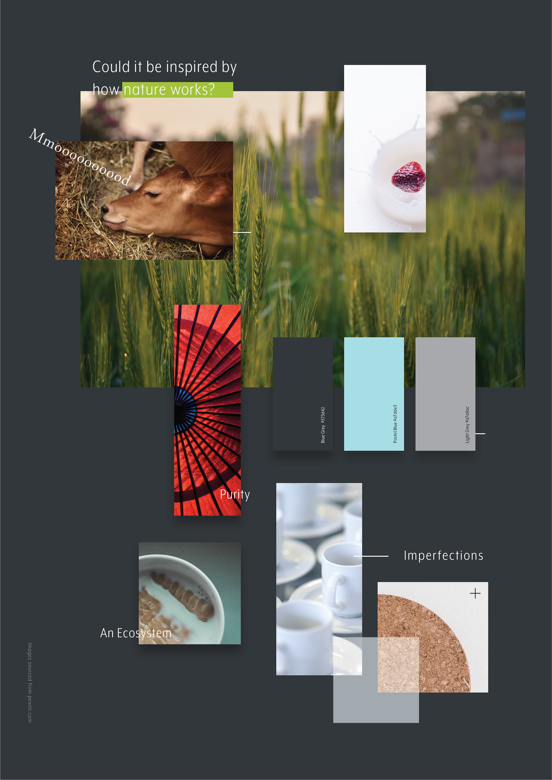
The project begins by analysing current milk carton packagings and the inspirations found online. By creating a mood-board in the process, I was able to dictate the direction of the project, including understanding the user's process of using the packaging. Working with examples found in the supermarket, milk cartons were disassembled and compared to learn from its differences, taking in consideration the material and method used.
Find out more about the initial processes via the Creative Process Journal (Part A)
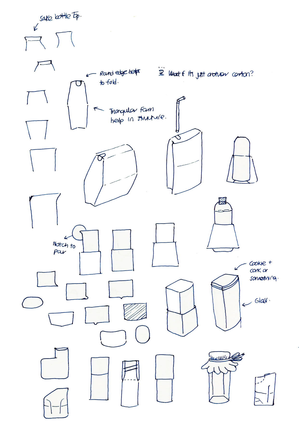
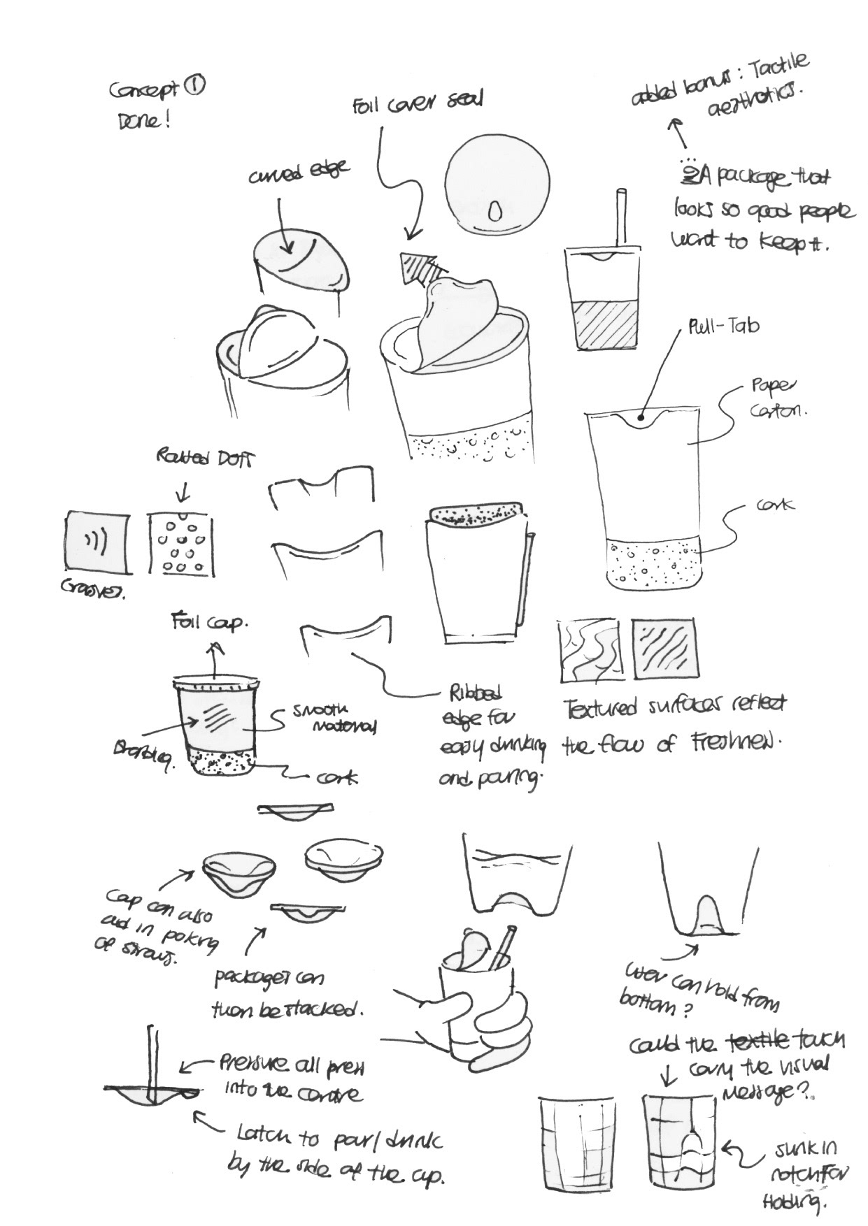
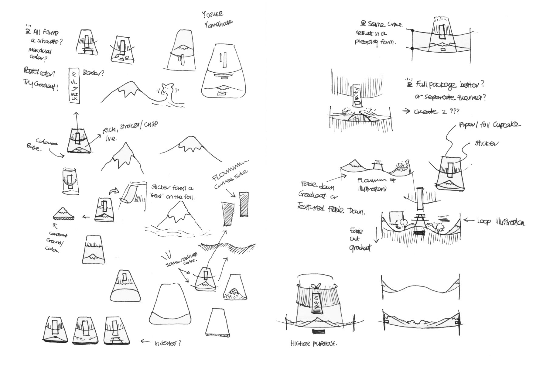
With a range of concept sketches, the design concept was derived through repetitive sketching of 2D to 3D forms, in the articulation of the usage of the packaging. For instance, sketches seen below depict the various method I perceived that would allow the carton to be opened more efficiently - all while being relevant to my research.
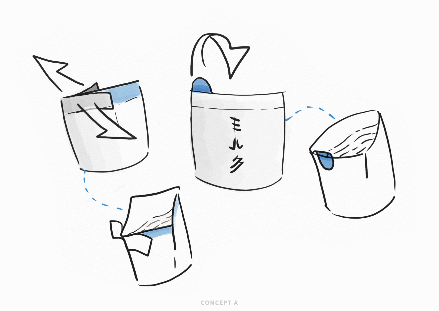
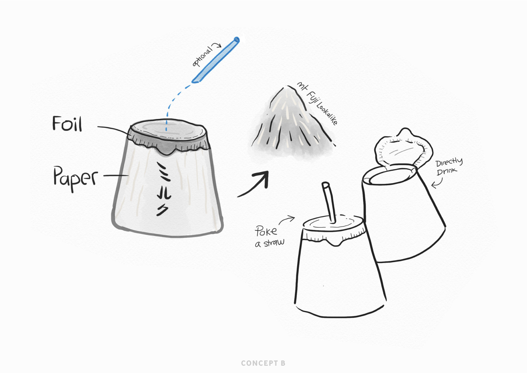
While concept A (left) felt interesting, a quick prototype made the sketch seem all but a dream. Concept B, being more practical, was sought to have a narrative behind it, where the form of the carton can be narrated as a representation of Mount Fuji.
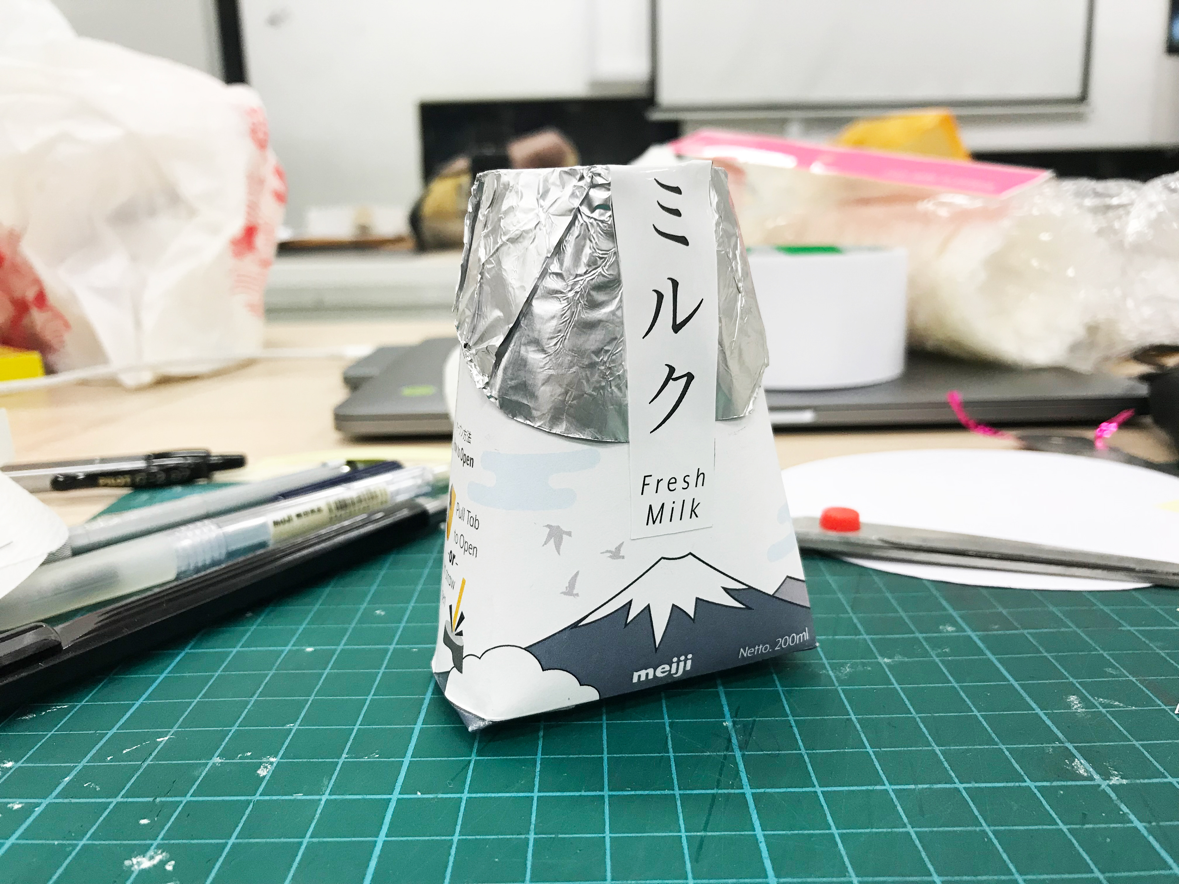
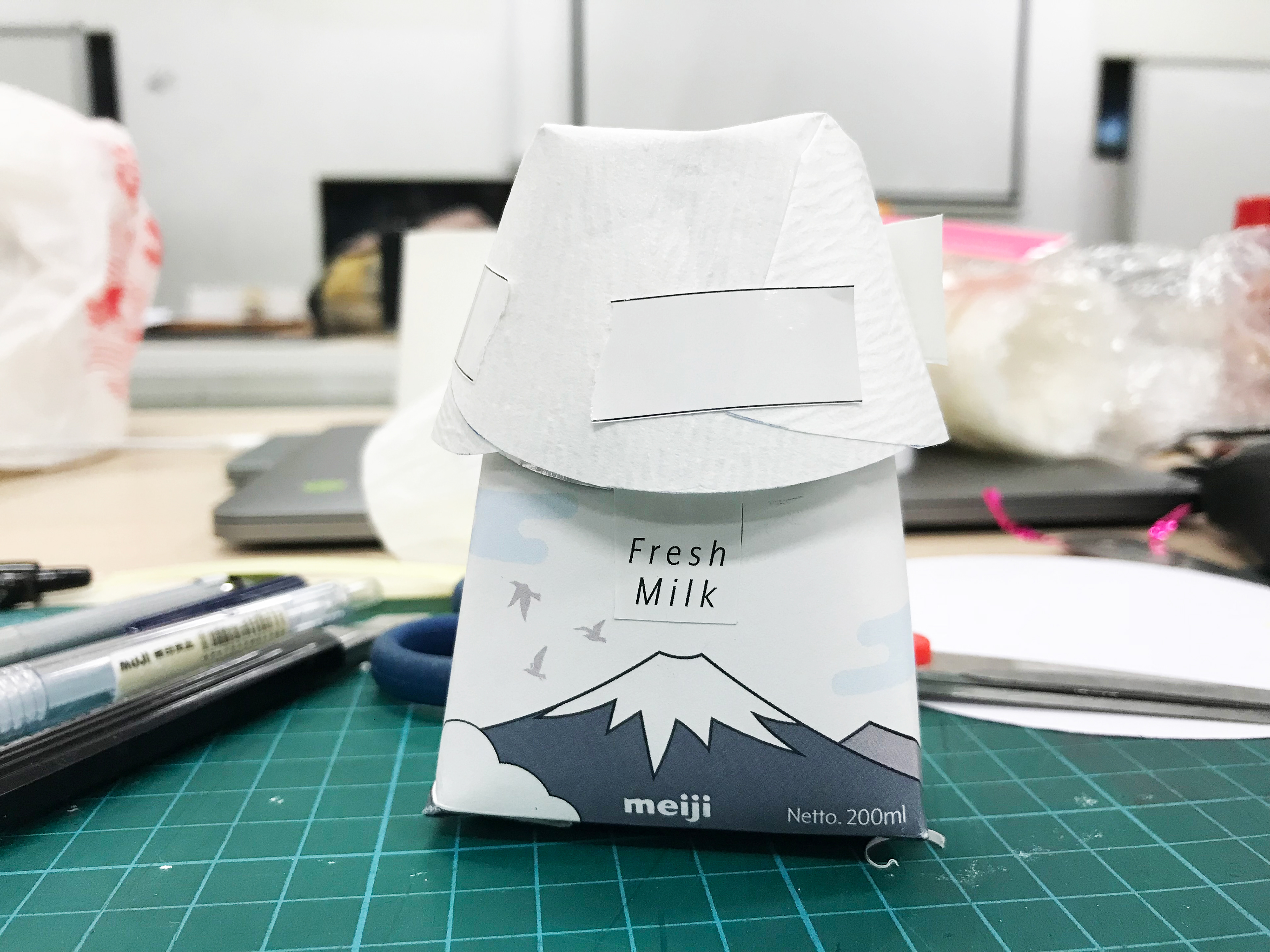
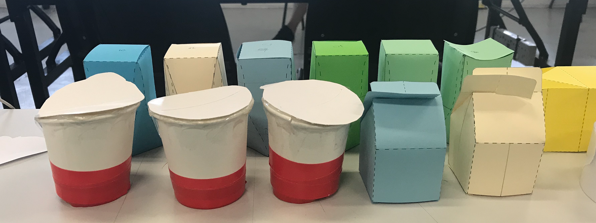
Moving into prototyping, this process moved from relating from templates found from online resources, to using existing materials such as a paper cup, before finally creating a custom template (seen in the top 3 images). Handy and not too large, the carton fits comfortably on the user's palm.
+ Prototyping is key in the developmental process - where it encourages creativity while making, a core skill of every designer
Mount Fuji, an iconic symbol of Japan seem as a close signifier of Japan. Out of literal communication, I felt the representation of the mountain would elevate the packaging design.
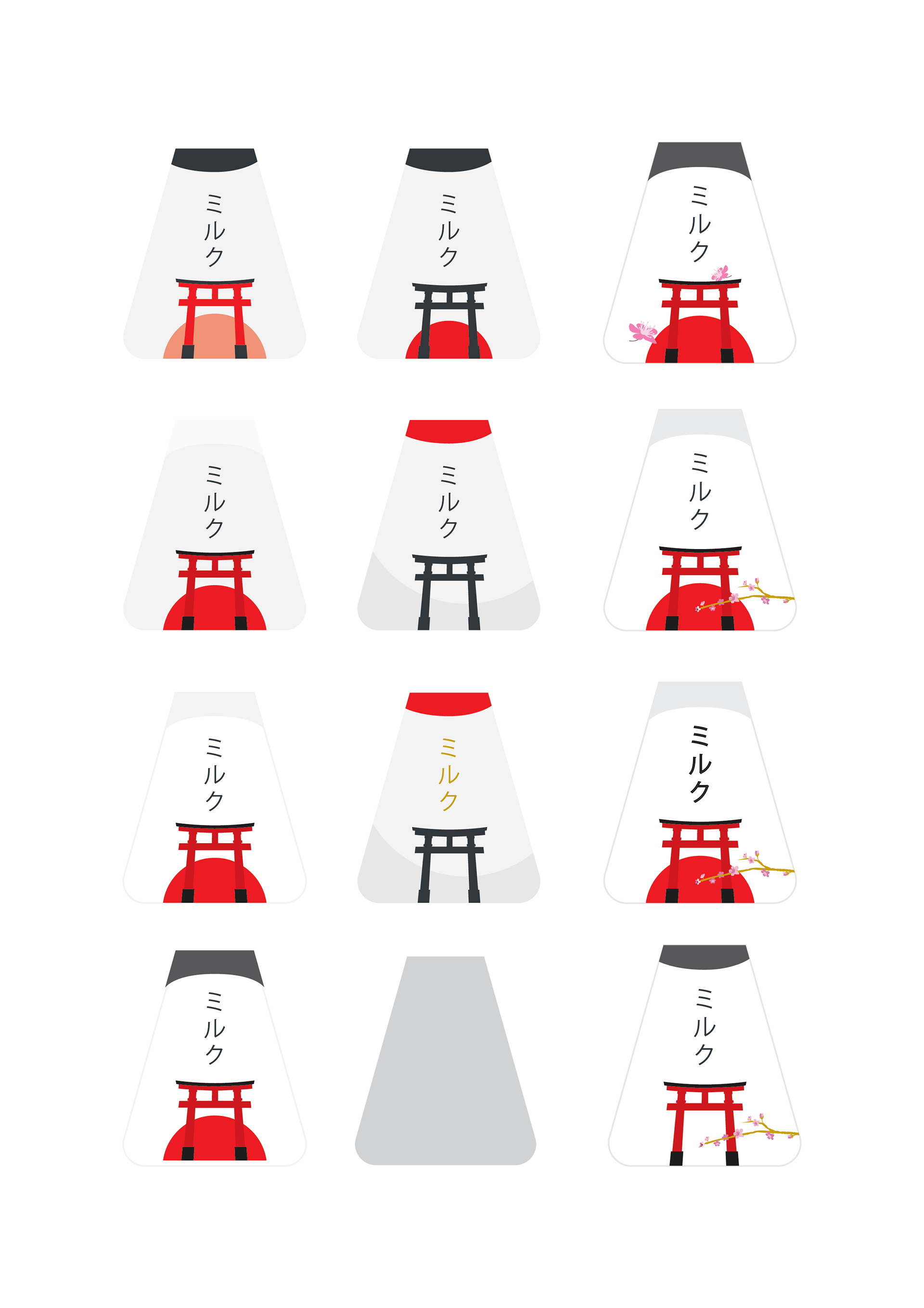
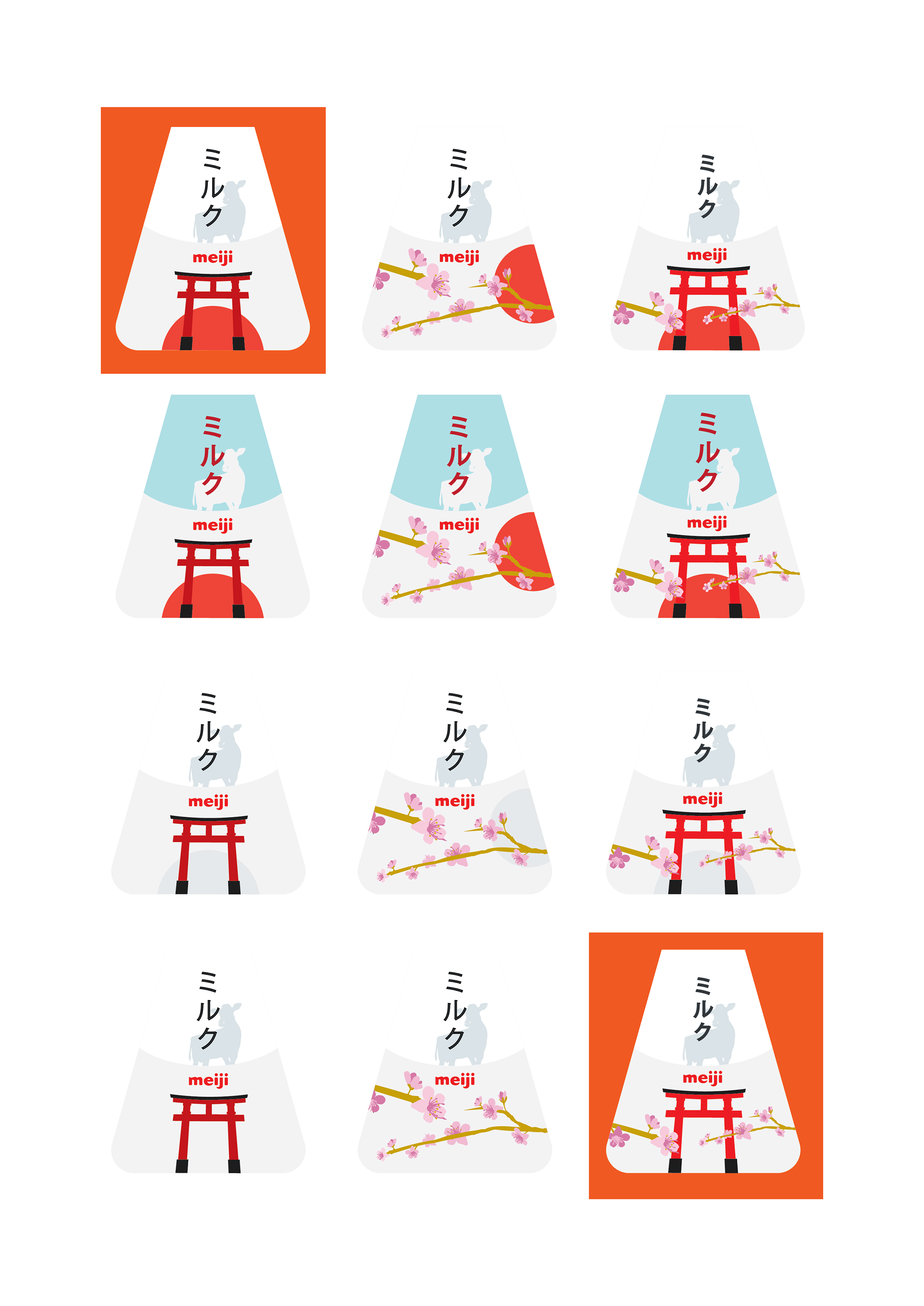
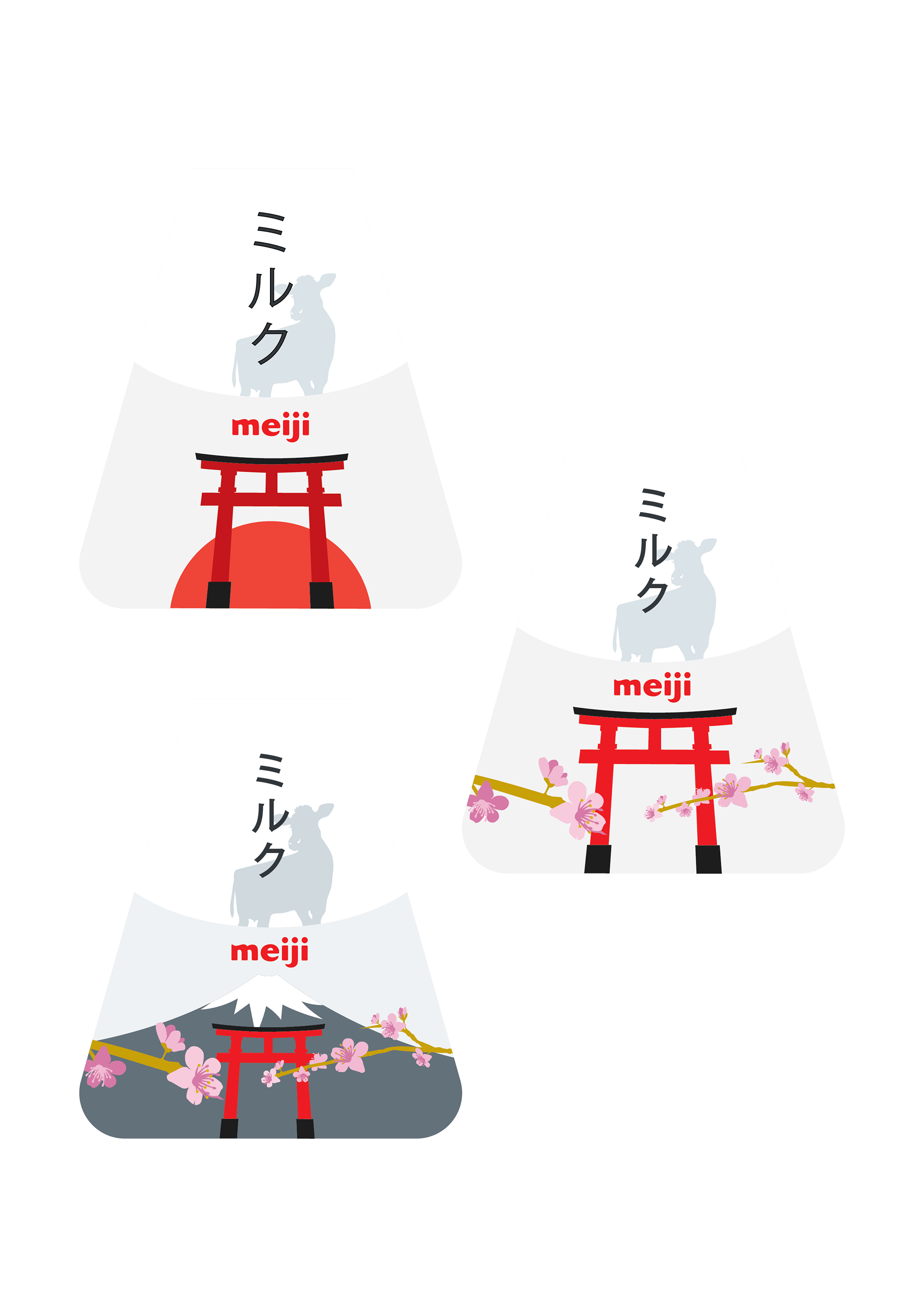
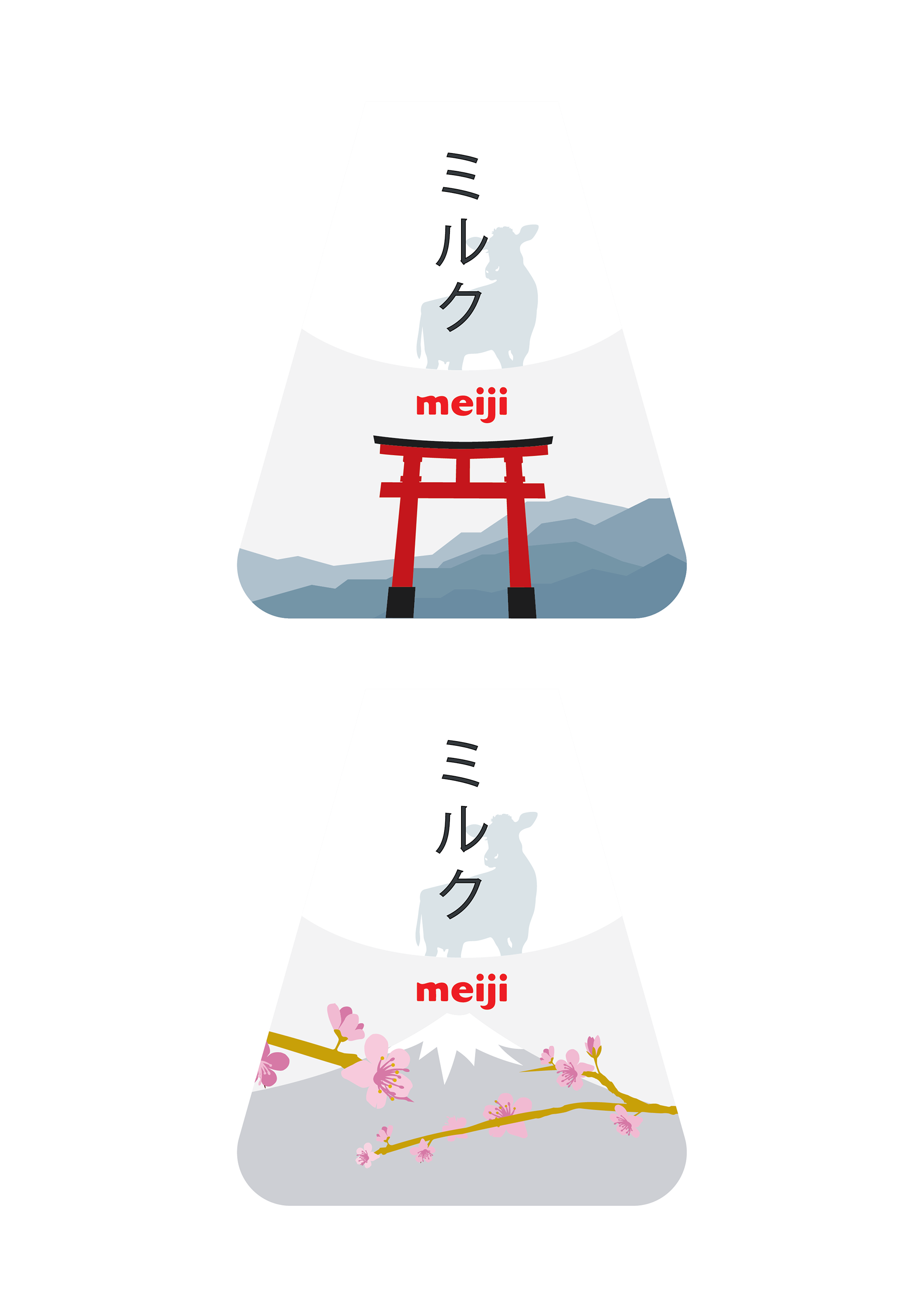
I sought for Fresh, Bold graphics to allow the product to shine on supermarket shelves, and as a form of respect to Japan's unique culture of practical minimalism. Working with iconic Japanese symbols such as the Torii, Sakura Flowers and its National Flag, other than a literal reference of a cow. While experimenting with the design, I found that by placing the Red circle within the illustration will make the design feel more striking.
Find out more about the ideation-development process in the second part of the Creative Process Journal (Part B)
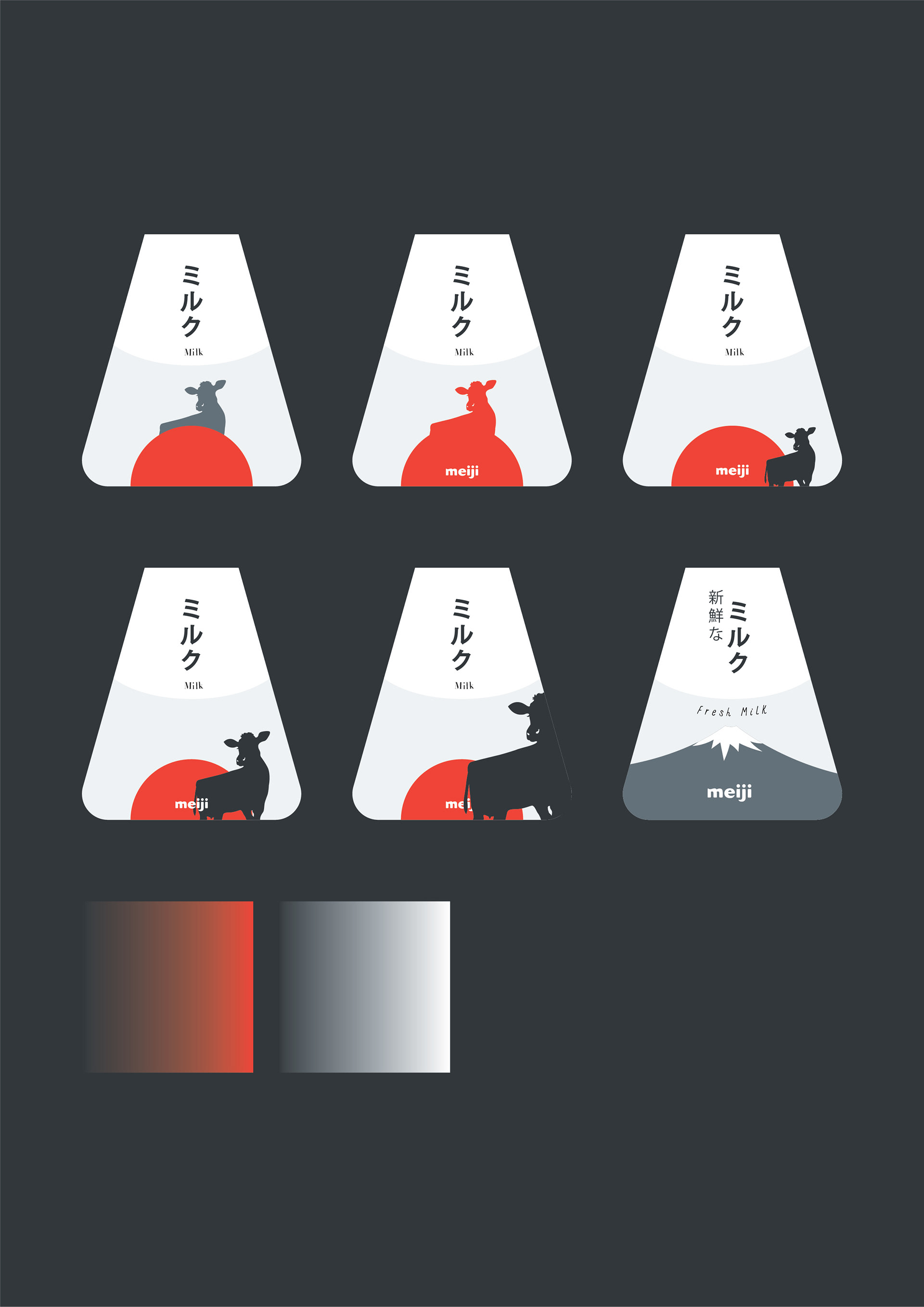
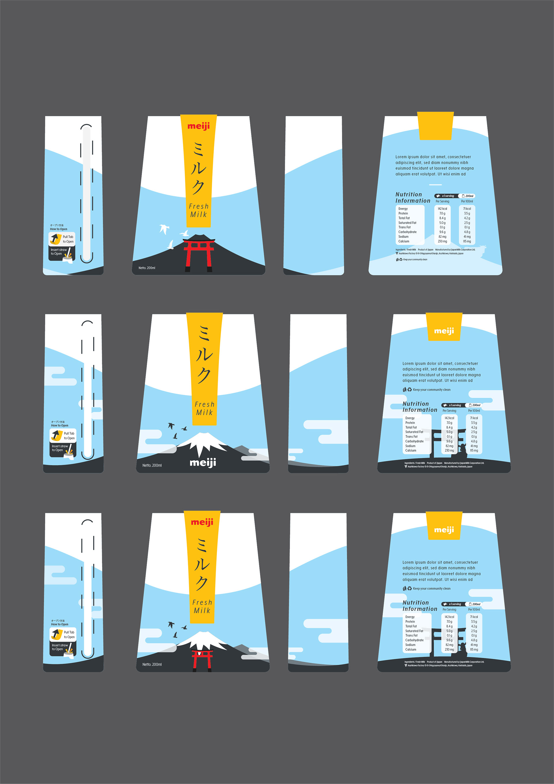
While the design may seem perfect on the screen, when applied to the material, the result, with the addition of printing limitations on the colour, made the striking blue and red dull. Hence, I opted for a compromise (shown below, compared with previous prototypes).

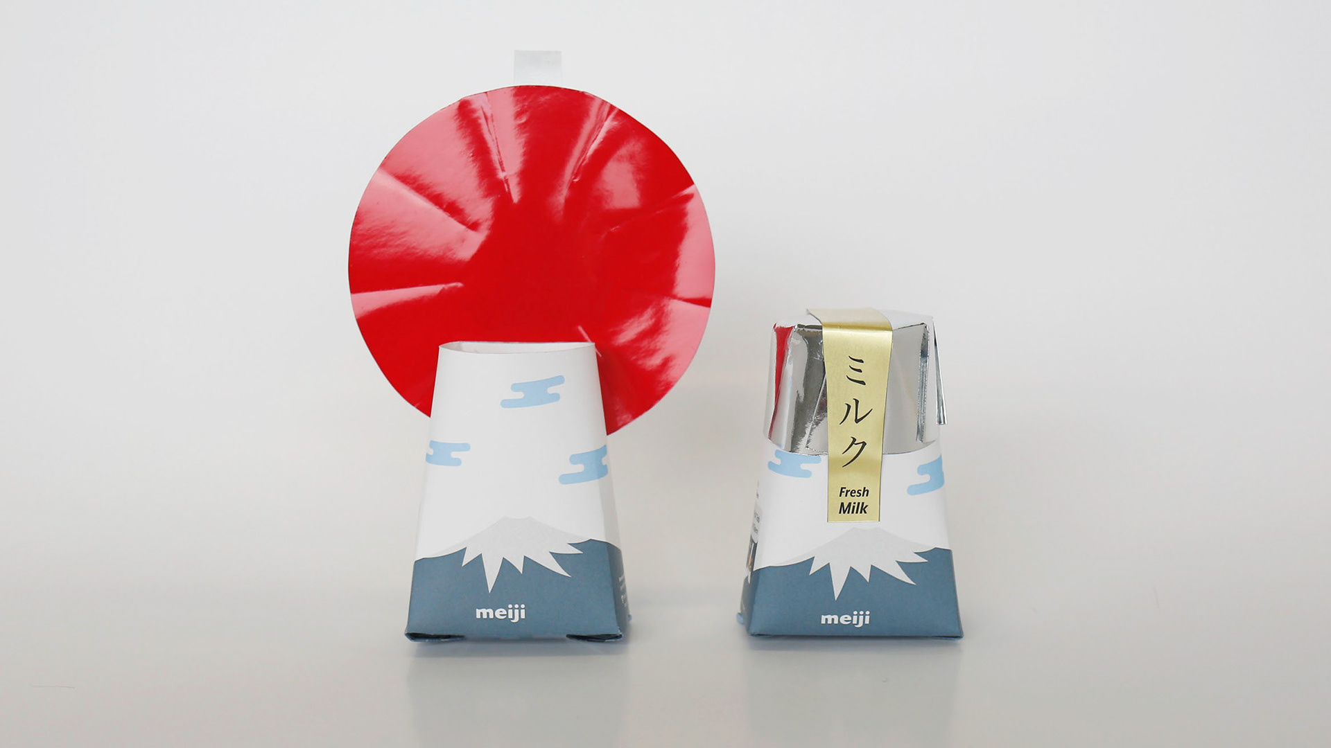
The Red Sun (represented by the foil) rises behind Mount Fuji (represented by the package), creating a moment of freshness and calmness, representing the visual message of the branding. To find out more about the research and developmental processes that went into the creation of this packaging design, view here (in 2 parts) - Part A - Part B
*Not actual product. This packaging is a concept design for submission into a competition.
*Not actual product. This packaging is a concept design for submission into a competition.

